
Websites are big. They can have hundreds of pages. It would be a lot of work if we had to go though and custom develop each individual page. Therefore, we use Umbraco. Instead of developing each page, we develop templates that can be reused with different content across the site. This means we no longer are thinking of the hundreds of pages, but rather a few dozen templates. But these templates are also made up of sections that are usually reused across multiple templates. So, why not go one step further and build these sections in a way that can be reused on different templates, allowing us to think of a website at a section level.
Using Document Types, Nested Content, and Doc Type Grid Editor, we can create components that are the sections of a page, and then build our pages based on these elements, adding even more flexibility into Umbraco.
What is a component?
"Component" might mean different things to different people, so let’s define what a component is in this context. Basically, it’s just a section of a web page. Draw a rectangle around something on your webpage design, and you can make that into a component.
Screenshot with different components highlighted
Okay, maybe that definition is a little simple, but it is the general idea. We also need to be sure that this “rectangle” includes everything at all viewports (responsiveness), all interactivity, all animations, and everything else that that component might be.
The idea is to have an entirely self-contained section of a webpage. Something that can be added to anywhere and can be added/removed/modified without affecting any other sections on that page. Once we have that, we no longer need to develop things on a page level but can work at a component level. And this gives us a lot more possibilities when authoring our pages, since we can pull from any of the components that are already built.
From a more technical point of view, a component will consist of a data model, a presentation view, and something to control how these are tied together. Also, the website should be built using a responsive grid CSS framework (I use bootstrap v3, which has a grid renderer available in Umbraco). This gives us the possibility to define components that can be inserted within the layout grid, giving us the ability to break down our sections even smaller. And the website should utilize some sort of base styles, so we don’t have to specifically style everything in each individual component.
Let’s build a component

To build a component, first we need to know what we are building. We will need to spec out how the component will work based on the business rules and the designs. Generally, these items are created on a page or template level, so it’s up to the developer to figure out the best way to break these things up into individual components.
The key thing to keep in mind while doing this, is to keep things simple. The components should be self-contained, including all styles (that are not part of the base styles). This means that if we have 2 items, that look similar, but still have some differences, they should probably be two components. And this means that each component will have its own complete set of styles, rather than sharing some parts. It’s against our nature as developers, but sometimes doing something twice, will actually save time in the long run since the logic will be easier to find, understand, and maintain moving forward.
Component Data Model
The component will have a data model, which will be a Document Type in Umbraco. There are many other ways to make a data model in Umbraco (archetype, custom grid config, custom class), however using a document type is the base for any page and will give us a lot of flexibility in how we implement our components. Here is our document type for our component.
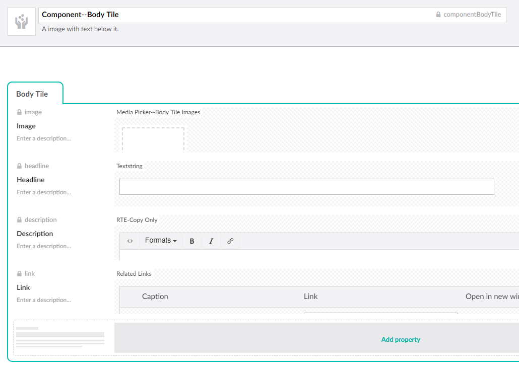
Component--Body Tile Doctype with an image, headline, description and link
Component View / Presentation
The presentation logic of our component will consist of a .cshtml view file, and any css or javascript logic that is needed for this component.
For the view, since our data model is created from a document type, it should be structured the same way as an Umbraco template, inheriting from the UmbracoPageTemplate. The only difference is that, this is a partial view, not a regular template view. Since we are going to have a lot of different components, let’s put them all in a component folder at /views/partials/components. We will also name the view file the same name as the component alias, so we know how to find it from our document type object. Here is our componentBodyTile.cshtml view:
@inherits Umbraco.Web.Mvc.UmbracoTemplatePage
@using Umbraco.Web.Models;
@{
     var image = Model.Content.GetPropertyValue<IPublishedContent>("image");
    var links = Model.Content.GetPropertyValue<RelatedLinks>("link");
}
<div class="c-body-tile">
    @if (image != null)
    {
    <div>
        <img src="@image.Url" alt="@image.GetPropertyValue("altText")" class="img-circle">
    </div>
    }
    <h3 class="c-body-tile__headline bodyTileHeight">@Model.Content.GetPropertyValue("headline")</h3>

    @Html.Raw(Model.Content.GetPropertyValue("description"))

    @if (links != null && links.Any())
    {
        foreach (var link in links)
        {
        <div class="align-bottom">
            <a href="@link.Link" target="@((link.NewWindow) ? "_blank" : "")" class="btn btn-primary">@link.Caption</a>
        </div>
        }
    }
</div>
Notice how the entire component is wrapped in div with a class of c-body-tile. This is so the component’s css and js can use this selector to identify this component. Our site will have general base styles and general JavaScript, shared across the site, however now when creating logic for this specific component, we will use this selector to ensure that our component logic, doesn’t impact anything else on the site. Here is the scss style sheet for this component from /scss/partials/components/bodytile.scss
.c-body-tile {
    text-align:center;
    margin-bottom:30px;
    display: flex;
    flex-direction: column;
    height: 100%;
    align-content: start;

    @media (min-width: $screen-sm) {
        margin-bottom:0;
    }

    img {
        max-width:100%;
    }

    p {
        width:80%;
        margin-left:auto;
        margin-right:auto;
        max-width:250px;
        @media (min-width: $screen-md) {

        }
    }
    .align-bottom {
        margin-top:auto;
    }
}
Layout Helpers
We’ve already said that the website should be built using a responsive grid framework. This means we will need to know how to add our components into the grid. We will also need to be able to make a row the full width of the page, and to remove any gutter padding between columns. Having simple utility classes for all of this will make adding components to pages simpler.
In addition, we will need the ability to alter the spacing between components. Generally, the components should have the minimum amount of space built in so we can control spacing on an implementation level, rather than within the component. To do this we add utility CSS style to have padding/margin on the top/bottom of the div – something like padding-def-smwhere it’s the padding on the {top}-{bottom} of the div. Then when we need spacing we will use these classes to add it.
I won’t get into too much detail on how to implement these things since it will depend on your front-end CSS framework, but make sure you have these capabilities.
Fixed Template Implementation
Ever since the early days of Umbraco, there have been Fixed Pages Templates. These are templates where there is a set layout, which defined by the code, and authors can’t really change it. Maybe there is logic built into the template to alter things based on the content value, but things are pretty much set. If an author wants to swap the order of two blades, that would need to be done by a developer, and takes a bit of work.
Fixed isn’t necessarily a bad thing. Fixed means that the layout must be consistent. It means authors can’t go crazy and make things look bad. This is good when we have a lot of pages that need to be consistent, like a product page.
To develop a fixed template, we will use Nested Content to create a data type from our component document type, and then add this to our page document type for the page. Here is our nested content data type for our component:
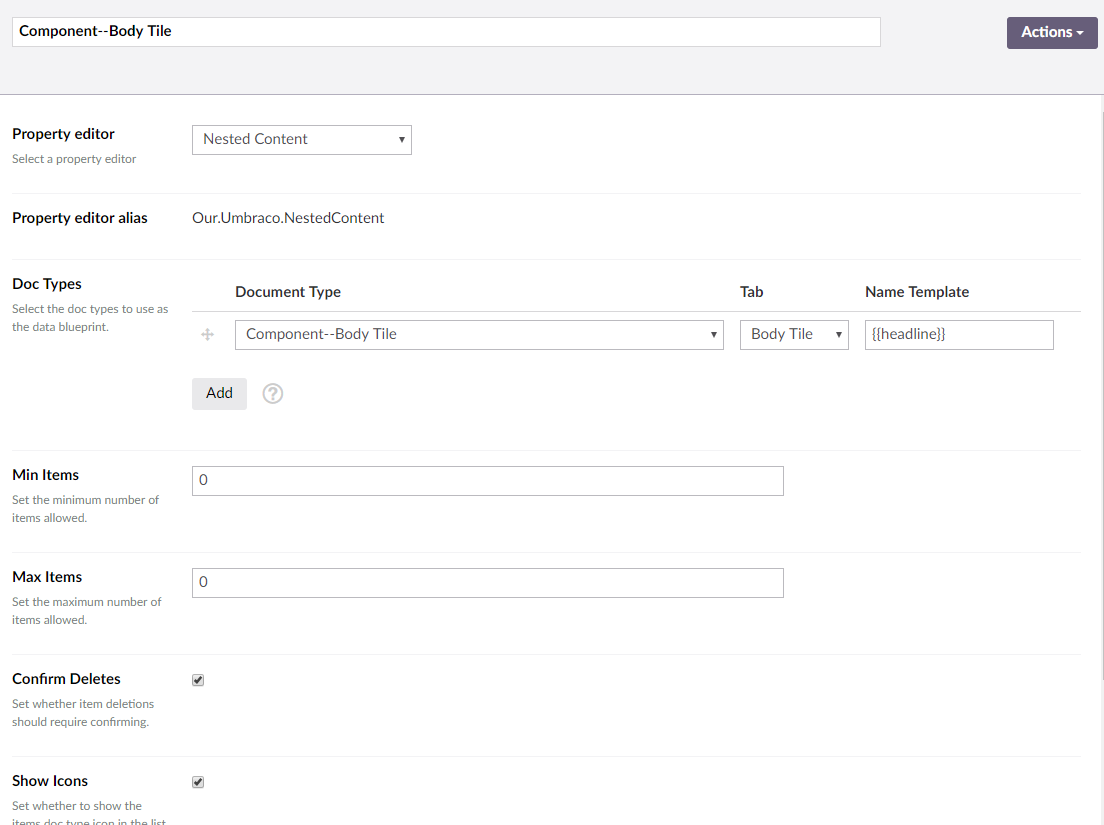
Component--Body Tile Nested Content datatype
We will add this data type to our “fixed” page document type. And then to render it in the template view, we get the data of the item and pass it into the partial template.
@{
    var bodyTiles = Model.Content.GetPropertyValue<IList<IPublishedContent>>("bodyTiles");
}

@if (bodyTiles != null && bodyTiles.Any())
{
    <div class="container">
        <div class="row">
        @foreach(var bodyTile in bodyTiles)
        {
            <div class="col-sm-4">
                @Html.Partial("~/views/partials/components/componentbodytile.cshtml", bodyTile)
            </div>
        }
        </div>
    </div>
}
Note that since it’s a fixed layout, the template view gets to control how it is laid out into a page, utilizing any of our layout logic that we need. Here I am adding the component into a 3 column grid.
Flexible Templates
Starting around Umbraco 7.2, a new type of template emerged that utilized the Grid Layout Data Type, a Flexible Page Template. Using this, authors now have more control in how things are structure on a page. If authors want to swap the order of two elements, it’s as simple of dragging and dropping and they’re done. No development change needed.
To get our components to work within the Grid Layout, we use the Doc Type Grid Editor extension to define a grid editor that uses our component. After installing the extension, we need to configure a grid editor to know about the component.
Here is our grid editor configuration from grid.editors.config.js for our component:
       {
          "name": "Body Tile",
          "alias": "componentBodyTile",
          "view": "/App_Plugins/DocTypeGridEditor/Views/doctypegrideditor.html",
          "render": "/App_Plugins/DocTypeGridEditor/Render/DocTypeGridEditor.cshtml",
          "icon": "icon-donate",
          "config": {
              "allowedDocTypes": ["componentBodyTile$"],
              "nameTemplate": "",
              "enablePreview": true,
              "viewPath": "/Views/Partials/Components/",
              "previewViewPath": "/Views/Partials/Components/",
              "previewCssFilePath": "/css/preview-styles.css",
              "previewJsFilePath": ""
          }
      }
Once the editor is configured, we need to configure the Grid Layout Data Type to define what grid columns this component is allow in.
I will allow it in my 3 column row.
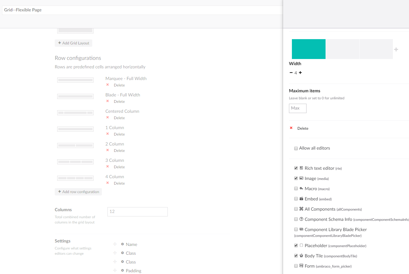
Grid--Flexible Page Grid Editor datatype
Now when we go to a content page that utilizes our grid layout, we will see our component as an option for that column and can add/remove/edit our component on our flexible page template.
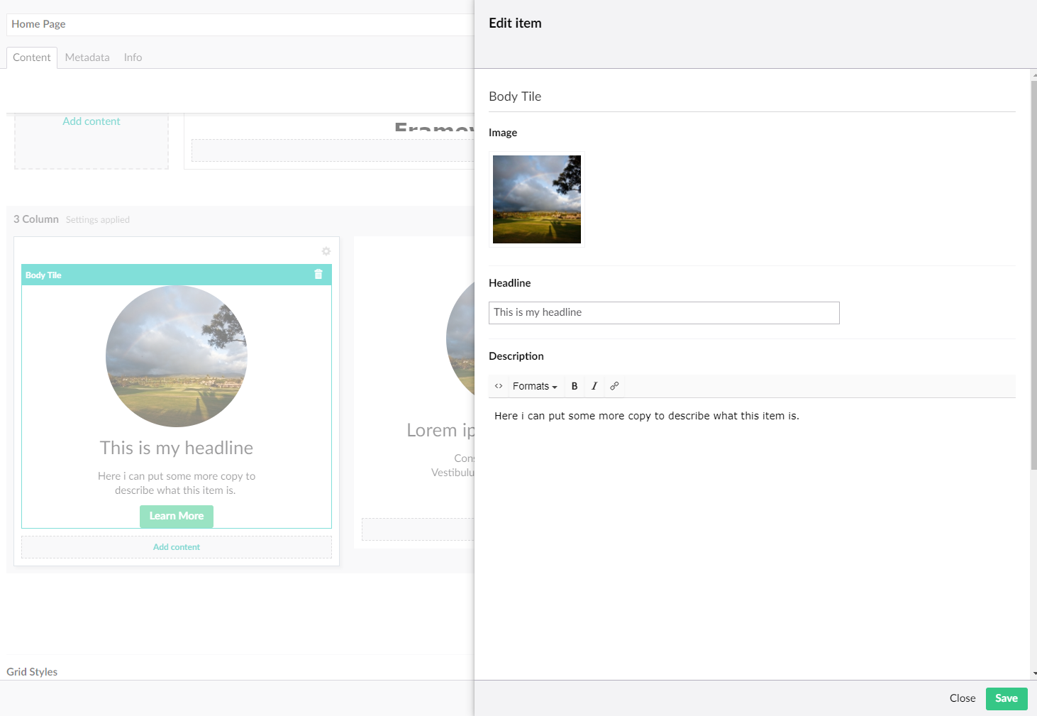
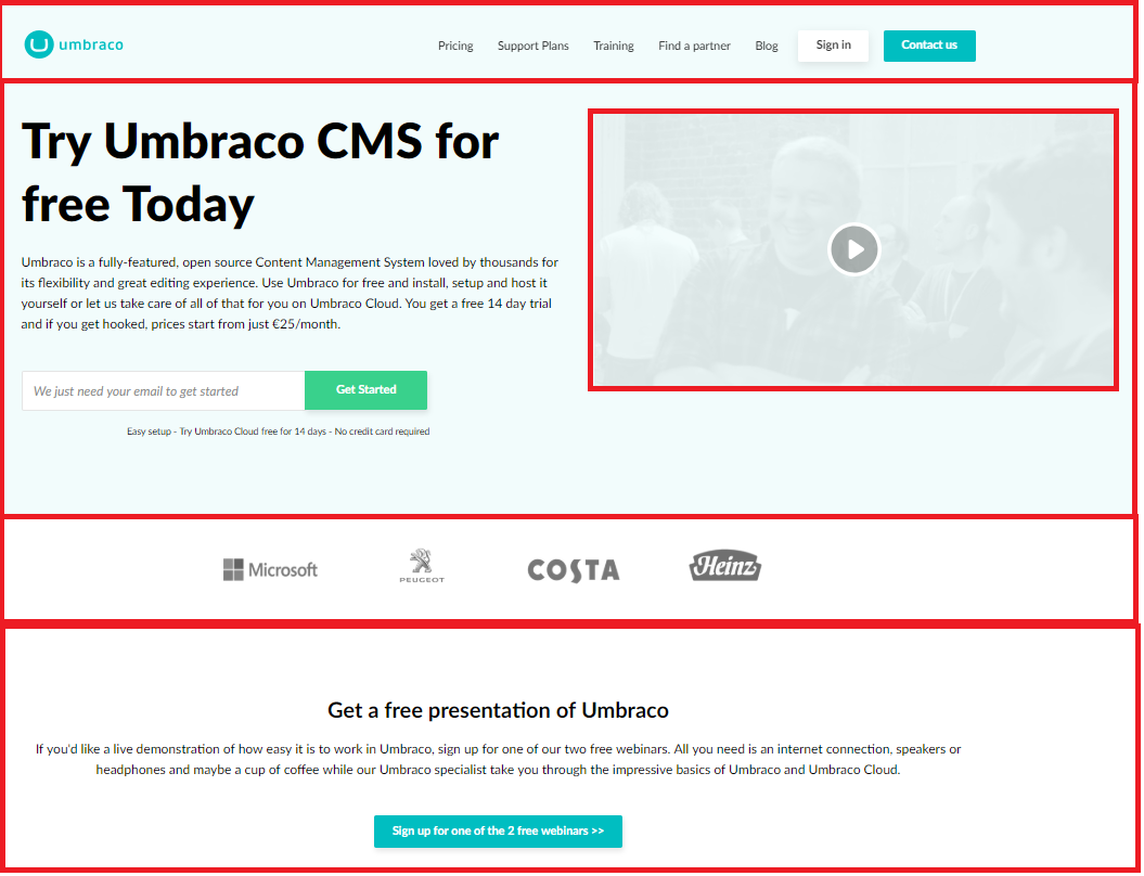
Adding the body tile as content to the homepage
Grid Columns (contained vs full bleed)
The out of the box grid renderers from Umbraco are great, but there are a few things it doesn’t have that we may need.
First, the ability to create a full width row for our component, which will allow us to create components that go the full width of the page. There are several ways to add this functionality, but one way is to modify our grid renderer so that if the row name contains “Full Width”, it doesn’t wrap the row in a container. Doing this based on the row name will allow us to set logic for what components can go in the full width rows.
We can do this by modify the 'bootstrap3.cshtml' grid renderer:
    <div class="umb-grid">
        @if (oneColumn)
        {
            foreach (var section in Model.sections) {
                <div class="grid-section">
                    @foreach (var row in section.rows) {
                        @renderRow(row, !((string)row.name).Contains("Full Width"));
                    }
                </div>
            }
        }else {
        ...
Spacing Setting
Next, we also need to have to add the ability to set spacing between rows. To do this we add a class setting in our grid editor, and then we can add our spacing classes here to be applied on the row. In our grid layout we add this to the settings:
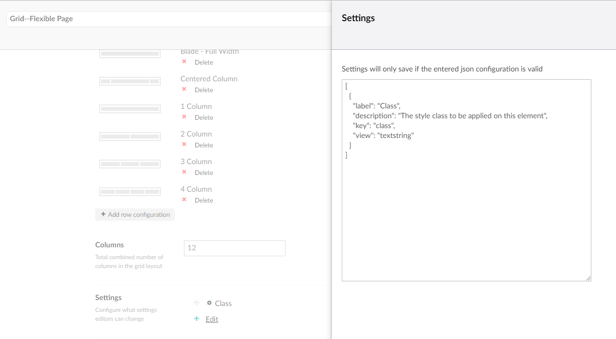
Adding a class setting to the grid editor
Then when editing the row, we can go to the row settings and type in the spacing classes we need.
Global Components
Another type of components we can make are Global Component. These are component that are used globally on the site, like a header and footer. We build these just like any other component on the site; it will consist of a doctype, view, and CSS. The only difference is in how we render them. Since the component's data model is a doc types, we can create a content node of this component and then get this node when rendering our master view.
Then to access this node, we will get it by content path. We generally only ever have one header and footer on the site, so we can say that the header content will always be the node at /settings/global-components/header. Then once we have the data model, we can render it.
@{
    var headerModel = UmbracoContext.Current.ContentCache.GetByRoute("/configuration/global-elements/header");
    if (headerModel != null)
    {
        <!-- (@headerModel.DocumentTypeAlias) -->
        @Html.Partial("~/views/partials/components/" + headerModel.DocumentTypeAlias + ".cshtml", headerModel)
    }
}
Component Library
The final way we will use our components, is to have a Component Library. This is a collection of components that are used on multiple pages and have the exact same content across the pages. Duplicating content on many pages is tedious, and updating it is even worse, but we can make a single content node for a component and reference this component on our pages, so the content is only managed in one spot. This would for example be a contact blade that is reused across the site.
Once we have created our component content node, to add it on a page, we will need one more component, theComponent Library Picker Component. This is a component that consists of a single content picker field, which will allow us to select our component content node. Once we have our selected content, since we named our view file the same as the doctype alias, we can figure out where the view is of the component and render it out.
Here is our componentComponentLibraryPicker.cshtml component view:
@inherits Umbraco.Web.Mvc.UmbracoTemplatePage
@{
    var component = Model.Content.GetPropertyValue<IPublishedContent>("component");
}
@if (component != null)
{
    <!-- @component.Name (@component.DocumentTypeAlias) -->
    @Html.Partial("~/views/partials/newcomponents/" + component.DocumentTypeAlias + ".cshtml", component)
}
Summary
Using this component structure, we can abstract our website down into sections of a webpage that can easily be added to our website pages any number of different ways. We can use Fixed Templates and Nested Content if we want to lock down a design, or Flexible Templates and Doc Type Grid Editor if we want to allow for flexibly. We can share components across different pages using our Component Library, and can even make Global Components that are on all pages.
No matter how we add it to a page, since all components are self-contained, we know that adding, removing, or changing any of our web page sections will not affect any other sections of the page. This allows us to think at a webpage section level, limiting the number of items we are building, and allowing for more flexibility in our Umbraco websites.