One feature of working for a local authority in the UK has been the need to conform to legislation around the way in which the public sector manage their digital content. Most recently the EU Directive that came into affect during September 2018 and since ratified in British law, has been the requirement for public sector bodies to provide completely accessible digital content.
What this has, in effect, meant is that many of us working on creating websites within the public sector have been through a trial by fire of sorts in terms of our understanding and appreciation of what web accessibility is, why it is important, and how to implement it.
It was therefore a natural step from applying this to the sites we manage at Leicester City Council - of which the main sites are all built using Umbraco - to thinking about how to begin to understand the relationship between Umbraco, its philosophy of open source community driven development, and the clearly growing need to have a product that is truly open and accessible to everyone who wishes to use it, be they developers, implementors, editors or just users.
What do we mean by Accessibility?
Web accessibility has become an important and increasingly recognised feature of the way internet web technology has developed, although the physical environment for disabled people still remains an enormous challenge that people with disabilities continue to face after centuries of suffrage and discrimination.
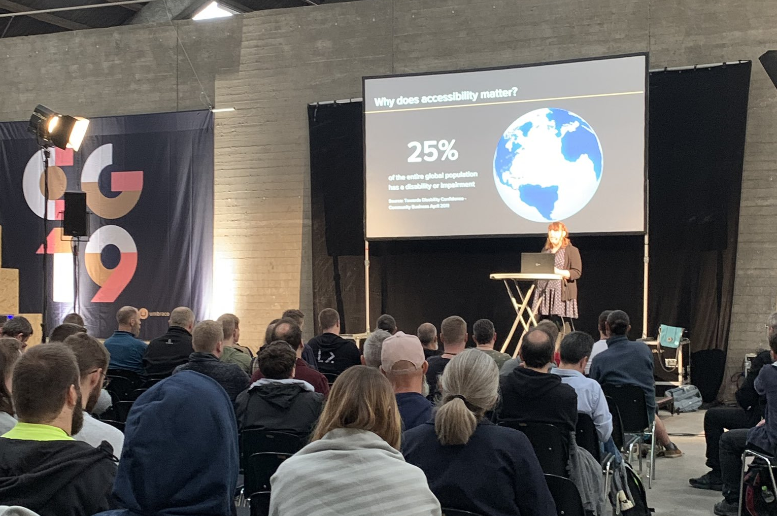
When I gave my talk at Codegarden 2019 about Accessibility, I used an analogy of how the ramp was used as the accessibility solution for the step. This is of course doing a disservice to the reality of how accessibility in physical environment has developed and continues to develop.
Whilst there are examples of accessibility dating back to the 1600's when the first typewriter was built to help a blind friend of the inventor to write legibly, it wasn't until the civil rights movements of the 1960's and 1970's that disabled people started to receive legal protection.
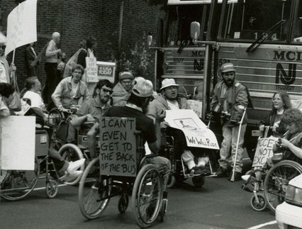
However despite earning legal recognition it wasn't until the 1990's that disability began to be more fully recognised as something that creates inequality and injustice. This is testament to the hard-fought sacrifices made by the countless demonstrators and protestors who had suffered hardship at the hands of state and society in order to improve the rights of disabled people.
Most recently legislation such as the Equalities Act 2010 in the UK has defined disability as a 'protected characteristic' meaning that special provision needs to be made in order to ensure that disabled people are able to function in society without being discriminated against.
It is this aspect that places every increasing emphasis on the development of internet technology in how it assists those with disabilities and access issues. The physical environment has been slow to adapt to the ways in which those with disabilities need to be able to function effectively – in stark contrast, the virtual environment of the web has been much more rapid in its development and indeed the founder of the modern web, Tim Berners-Lee, references web technology in its ability to provide resource for people with accessibility needs:
“The power of the Web is in its universality. Access by everyone regardless of disability is an essential aspect.”
which makes the case that the web should be accessible by default and that if parts of the web are inaccessible whether by design or not, it is therefore not fulfilling its remit as part of the web.
Universal Design
A key development in accessibility was how the aforementioned civil rights movements inspired changes in approach to design and it was during these era's that the universal design movement was first developed with the aim of ensuring that the design of products and services are available to as many as possible and meant a change in the way design approached problems by placing the needs of the users at the centre of design philosophy.
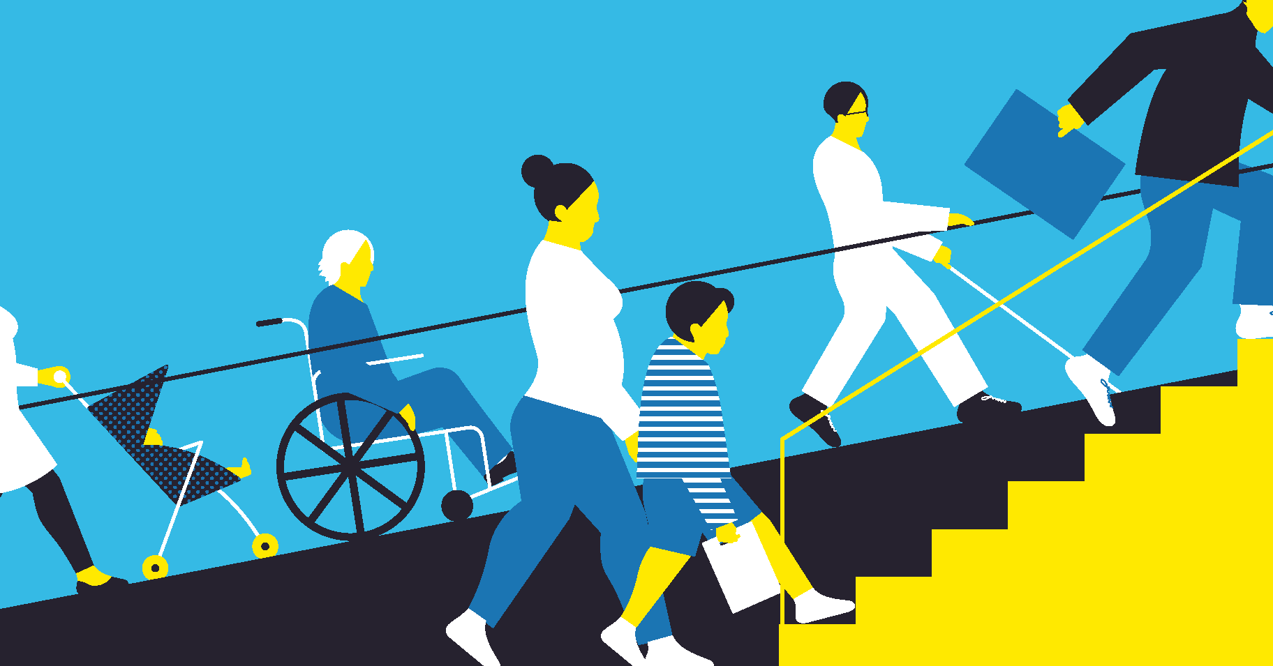
This was a landmark in the way usability, of which Universal Design is a component, evolved into including users in the development and design of goods and services from the inception rather than as an afterthought. Simply put, by asking the question of users 'what do you need' rather than 'I will tell you what you need' – it gave voice to the diversity and range of needs of users from which accessibility and the many issues it presents was born.
Why should you care about accessibility?
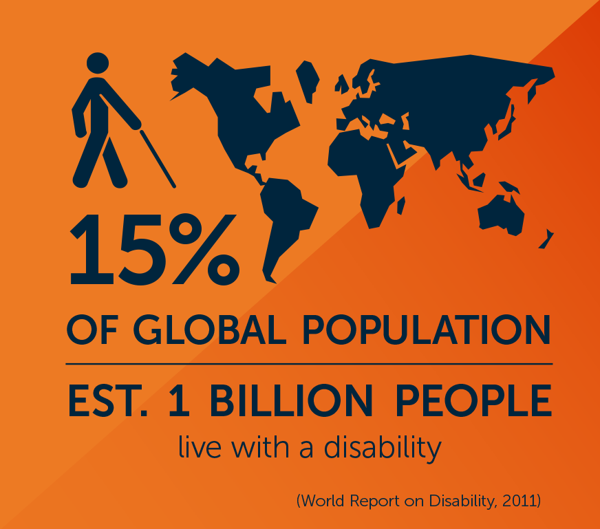
At any given point in time, studies have identified that between 15-25% of the worlds population have some form of disability or impairment. The data varies wildly with the 15% figure being the most commonly reported figure:
Yet is likely this is a gross under-estimation since it disability is very hard to estimate and different parts of the world consider disability, both culturally and legislatively, in different ways so there is no single data set that can give an accurate report of the worlds disability population. However what is true and well understood by researchers, is that disability is strongly under-reported for a number of reasons the most prevalent being the stigma associated by being classed as someone with disability and it's impact on an individual's socioeconomic status and well-being.
If we were to take the estimation of 25% as true – then this equates to a quarter of the worlds population, or 1 in 4 people who potentially have accessibility needs.
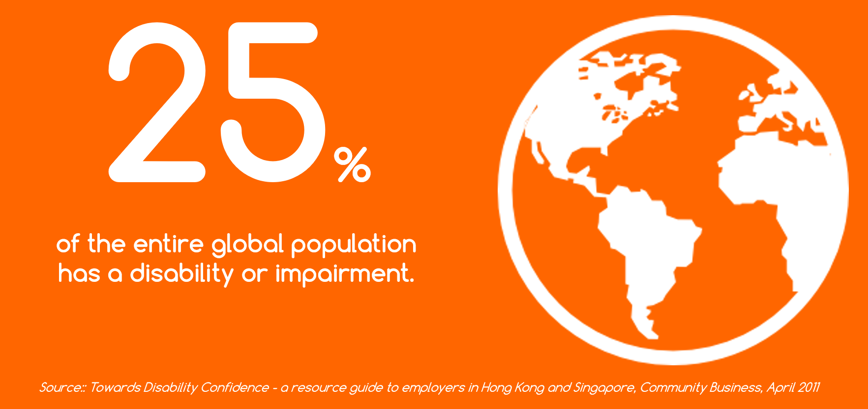
It is not therefore a great leap to appreciate that, if products or services are not given proper consideration in their design for accessibility, they are then potentially excluding 25% of their potential market. In strict economic terms, this would be an unacceptable loss for something that is so easy to achieve.
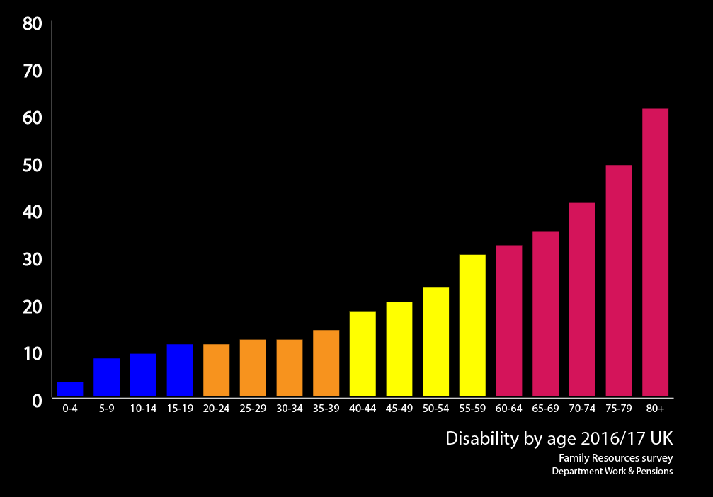
Compounding this issue is the way in which age affects both disability and accessibility needs. The following graph indicates that up to 80% of people will have some form of disability when they reach the later years of life. As such then, it means that this issue is going to impact almost everyone at some point:
Who does it affect?
Accessibility encompasses all disabilities that affect access, including:
- auditory
- cognitive
- neurological
- physical
- speech
- visual
Accessibility also benefits people without disabilities, for example:
- people using mobile phones, smart watches, smart TVs, and other devices with small screens, different input modes, etc.
- older people with changing abilities due to aging
- people with “temporary disabilities” such as a broken arm or lost glasses
- people with “situational limitations” such as in bright sunlight or in an environment where they cannot listen to audio
- people using a slow Internet connection, or who have limited or expensive bandwidth
Web Accessibility
The groundwork for web accessibility was laid in the way universal design developed to be inclusive and user-centric in how it met its design needs. It meant that the concept of accessibility in design process was already developed to the extent that when the modern version of the internet was introduced in the 1990's, accessibility was at the centre of it's philosophy in being platform for providing an extensive information resource that could be used by everyone irrespective of their personal circumstances.
As the popularity of the internet increased, so did the need for ensuring that rules and standards could be applied and maintained to ensure the internet would remain true to the principles of usability and universal design.
The World Wide Consortium (often referred to as W3C) were responsible for developing and maintaining the consistent integrity of the way in which the web worked, and as accessibility is a key component of this, they developed the Web Content Accessibility Guidelines or WCAG as it is also known.
WCAG sets a group of standards and guidelines for ensuring web pages are as accessible as possible. The W3C created a framework that forms the basis through which accessibility standards can be applied and measured known as POUR:
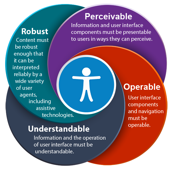
- Perceivable: Users must be able to perceive it in some way, using one or more of their senses.
- Operable: Users must be able to control UI elements (e.g. buttons must be clickable in some way — mouse, keyboard, voice command, etc.).
- Understandable: The content must be understandable to its users.
- Robust: The content must be developed using well-adopted web standards that will work across different browsers, now and in the future.
In order to measure these, the WCAG standard has three levels of measurement that determines how well a site meets the POUR criteria:
- A
- AA
- AAA
In the majority of cases, along with the EU Accessibility Directive, AA is the level at which sites should operate if they are to be considered accessible.
Making a site Accessible
Web accessibility in its most basic form can be summarised into the following simple rules:
- No reliance on just Mouse or Touch
- No information that purely relies on being able to see it
- No information that purely relies on being able to hear it
- Few distractions and a clear logical path with understandable language
- No motion or flashing without controls
- Any combination of the above
This can be achieved most simply by:
- Use semantic markup in native HTML
- Make it keyboard functional
- Provide support for screen-readers
- Simplify / optimise presentation
- Test Test Test
There are a number of other features that should be included in a good accessible site. To name a few:
- SkipLinks
- Alt-Text on graphics
- Captions and transcripts of audio / visual content
- Machine-readable text instead of embedded text in images
- Controls of any moving feature such as Video content or animation.
Developing with Accessibility
To understand how accessibility works we must first look at how assistive technology is able to access the information it needs in order to relay the information back to the user.
In the major operating systems exist several API's designed by the developers for accessibility. These API's aren't available to web developers however screen-reader technology is able to query these API's in order to retrieve information about the status of the operating system and the tasks that it is currently performing.
When a browser accesses native HTML objects, it then builds a DOM in order to populate what is commonly known as the 'accessibility tree'. Whenever the user interacts with the browser interface, the DOM is rebuilt and the accessibility tree is then repopulated providing information to the API that screen-readers access and relay back to the user.
This means therefore, that screen-readers are limited to only what is held within the DOM, and in the case of web technology, this means native HTML which provides extensive information about the HTML to the user – just as long as the web code is being used in the way for which it is designed. Elements such as img, a, header, footer, body all provide information to the user about the that particular element.
There are exceptions to this. span and div tags, normally used for structure, relay no information to screen-reader technology about wthe function or status of the tags.
This is a problem since the usage of span and div is increasingly common as ways of performing tasks and functions without being limited to the role of the semantic HTML.
In the following example I can demonstrate how a span tag can be repurposed as a simple HTML button:
<span onclick="goToLink(event, 'http://www.w3.org/')">
          W3C website
</span>
However as this is using an onclick event within a span object – there is no semantic information that is updated to the accessibility tree rendering this useless for those using assistive technology.
Therefore, in order to make this element accessible we can add additional code that at least provides some usefulness when it comes to screen-readers.
Tab-Index
By adding a tab-index=”0”, this will make the element focusable and accessible by the keyboard tab key.
<span onclick="goToLink(event, 'http://www.w3.org/')" tabindex="0">
          W3C website
 </span>
It is certainly possible to change the tabindex number, however using “0” will place the object in the order that it appears in the HTML code. If the developer alters the tabIndex value there is a high risk of creating problems down the line if the code gets updated or alters in any way. Therefore it is always recommended to use “0” and to restructure the code accordingly.
CSS Styling
#accessLink {
  color: #009;
  background: transparent;
  text-decoration: underline;
}
#accessLink:hover,
#accessLink:focus {
  color: #000;
  cursor: pointer;
  outline: solid 1px white;
}
The span object can be rendered to display as a normal hyperlink using CSS properties, most notable of which is to ensure that there is something to indicate that the object has focus – a key element of accessibility.
Javascript
<span tabindex="0" onclick="goToLink(event, 'http://www.w3.org/')" onkeydown="goToLink(event, 'http://www.w3.org/')">

function goToLink (event, url) {
var type = event.type;
if (
  (type === 'click') ||  (type === 'keydown' && event.keyCode === 13)
) {
  window.location.href = url;
}
We can also use javascript to provide extra keyboard functionality so that the keyboard event 'keydown' triggers the code to visit the URL.
Role=”link”
Finally we can use an ARIA label to provide information about the object that will be relayed to the screen-reader – more about ARIA in the next section of this article.
<span tabindex="0" role="link" onclick="goToLink(event, 'http://www.w3.org/')" onkeydown="goToLink(event, 'http://www.w3.org/')">
Finally, what should be apparent to anyone familiar with standard HTML, is that we have had to do a lot of extra work to turn an object such as a span or div tag into something that behaves akin to a normal a tag. A lot of time and effort can be saved by developers if they are able to challenge themselves to develop in such a way that native HTML can be used as extensively as possible without the need to provide all this extra effort in turning something into an accessible object.
WAI-ARIA
ARIA, which stands for Accessible Rich Internet Applications, helps with dynamic content and advanced user interface controls developed with Ajax, HTML, JavaScript, and related technologies. Currently certain functionality used in Web sites is not available to some users with disabilities, especially people who rely on screen readers and people who cannot use a mouse. WAI-ARIA addresses these accessibility challenges, for example, by defining new ways for functionality to be provided to assistive technology. With WAI-ARIA, developers can make advanced Web applications accessible and usable to people with disabilities.
The number one rule for using ARIA in HTML, is to try not to use ARIA in HTML (if it’s not needed).
HTML5 semantic elements provide us a wide range of elements that come with implicit meaning to them, similar to the explicit meaning we can define using ARIA.
So, wherever possible, we should use a semantic HTML element in place of an ARIA attribute.
Some examples of ARIA states are below however the reader is recommended to research ARIA for their own needs:
- aria-checked: indicates the state of a checkbox or radio button
- aria-disabled: indicates that an element is visible, but not editable or otherwise operable
- aria-grabbed: indicates the 'grabbed' state of an object in a drag-and-drop operation
For a full list of ARIA states, consult the ARIA list of states and properties.
Checking Accessibility
There are a vast array of tools and techniques for checking accessibility that exist on the web. Some of them aim to be as comprehensive as possible, some are much more specialist focusing only on certain types of accessibility, whilst others may contain unique features or techniques that offer insight into accessibility issues.
Here, I have listed a few of my favourite tools for accessibility. It is not an exhaustive list nor is it in any particular order. Before I give my list, I must make an important plea to those seeking to use these kind of tools in order to check accessibility of their work: There is no single method or tool that can ensure your site is accessible.
The only true way to check if your site is accessible is through manual testing – preferably by someone with accessibility needs.
Accessibility Testing Suites:
- Tenon
- aXe
- AChecker
- Sort Site
- Google Accessibility Developer Tool
- The European Internet Inclusion Initiative’s page checker
- Asqatasun SiteImprove
Accessibility Browser Extensions:
- Wave
- ChromeVox screenreader extension
- Accessibility Insights
- NoCoffee Vision Simulator
- I Want To See Like The ColourBlind
- MetaMatrix Web Disability Simulator
- SiteImprove Browser extensions
Other Useful Accessibility Reources:
Further Reading:
Developer / Designer tools:
- Visual Studio accessibility extension
- Visual Studio Code accessibility extension
- Frend Components – a useful collection of accessible front-end components
- WAI-ARIA Authoring Practices
- The A11Y Project
- Bootstrap Accessibility Plugin
- AngularJS Accessibility
- Visual ARIA
Umbraco Accessibility
In the final chapter of this article, I want to take the opportunity to take a look at how accessibility relates to Umbraco from a development perspective. In order to achieve this we should first consider the notion that is it feasible that those with accessibility needs, particularly those requiring assistive technologies, can be developers too? The answer seems obvious and almost too simple to require the question - yes of course they can and they should. However - if products such as Umbraco have not been built from the ground up using accessibility standards as a principle behind the way in which the CMS is built - then it stands to reason that there are not going to be many developers who come from disabled backgrounds.
This seems contrary to the beliefs behind the way in which Umbraco has been conceived and developed as the 'Friendly CMS' but in all fairness - there will be no products of a similar nature that will have managed to address this and in fact, whilst the big players like Microsoft and Apple seem to have made real advances in accessible technology, compared to the rapid development of web technologies, accessibility is far from being at the forefront of any innovative web developers mind.
At least, that was the state until a few years ago. We've seen real strides in accessibility of late, particularly from Google who have upgraded their lighthouse auditing tools to be much more comprehensive and useful. Similarly a slew of accessibility libraries, api's, git's etc have really started giving web accessibility the status it has always deserved. People have finally sat up and started to take note. Similarly, the philosophy behind Umbraco, combined with its adaptability and potential for open-source community development and the willingness of the Devs at Umbraco HQ to engage with accessibility - means it is the perfect environment in which to begin introducing Umbraco as the most universally accessible platform that will place it beyond the reach of any of its competitors.
So how accessible is the back office of Umbraco?
The Umbraco backoffice is not accessible. It is a complex UI based around AngularJS and Bootstrap and was not built with accessibility in mind, with the vast majority of elements being Div's augmented by AngularJS directives.
The screenshot below highlights the issues faced:
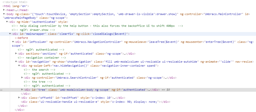
Further to this – adding accessibility into the backoffice is not a simple task – adding roles and aria attributes or tabindex states can easily break things. Similarly there is no testing framework that targets accessibility specifically and developing something such as the Umbraco backoffice with accessibility in mind is going to be an extensive, time-consuming process.
Umbraco Accessibility Team
It is at this point we can introduce the Umbraco Accessibility project that was created only in April this year. A collaborative effort initiated by Mike Massey between members of the Umbraco community with some input from those at HQ.
After a little bit or organisation, a Trello board and some fantastic contribution from a multitude of people we’ve already started making some progress. Danny Lancaster put together an accessibility audit that has been put onto Github so that people can easily find a issue that could work on the Umbraco Github and we set a goal of 5 submitted PRs before CodeGarden 19.
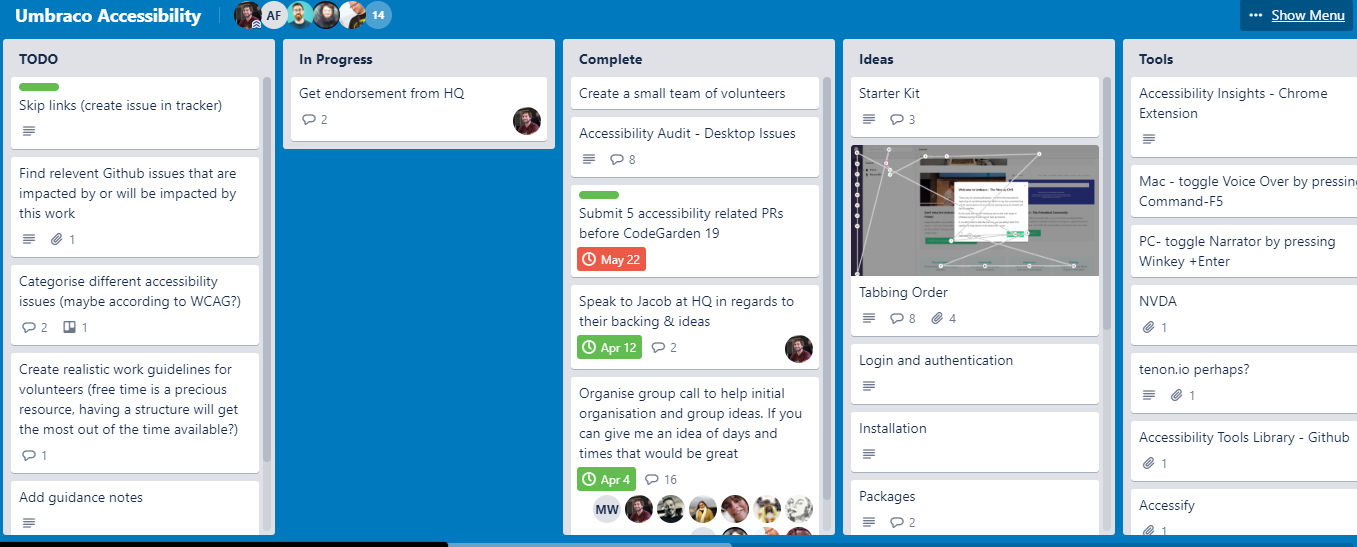
The audit process involved several manual and automated tools and techniques. The first check for all page types involved running automated tools to find potential issues within the code base. Although automated checks are a great way to find initial issues, only human interaction can find true accessibility challenges, so although all automated findings were documented, most tests were manual based. The manual checks involved using several tools to re-enact how a user who may experience difficulties navigating the site. For example, a user may only have access to the keyboard to navigate the site so must always be able to navigate through all components/elements successfully and be aware of their page location. This highlights a need for sufficient tab/focus states across the CMS and the current lack of them. Another manual tool used is that of screen readers; an assistive technology that aids users experiencing partial or full blindness. By navigating through the CMS using a screen reader, it highlights potential areas users may have trouble navigating past - such as misleading link names or non-existing alternative text.
These processes were done on a page type basis which include looking into some of the package options, settings and forms. Alongside this, additional focus was applied for the new multi-language feature and the infinite editing.
Once the issues had been found and triaged – of which there were 151 identified – each issue was assigned certain WCAG guideline references to each. This is to aid the developer in finding a fix, as well as keeping track of amount per issue (e.g. the amount of hover states missing, or the amount of A level issues compared to AA or AAA).
What has been done so far?
At the time of writing (before CG19 and one month after that issue was created) there have been 16 PRs submitted, of which 12 have been merged into core.
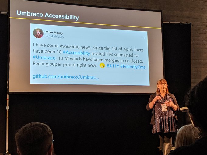
This is fantastic news and it is testament to the time and commitment of those already involved in the accessibility of the backoffice of Umbraco that it should be considered a great achievement in such a short period of time.
Of course, a daunting task of continuing to work on the issues remains – and currently there is only a select few working on the project. However, after the talk at Codegarden 19 and with articles such as this, we have received some great feedback from the Umbraco Community of those willing to get more involved, as well as more engagement and willingness from UmbracoHQ to evolve and develop Umbraco into a more accessible product thereby staying true to its roots as the 'Friendly' CMS.
If you want to get involved – please do.
Accessibility Trello Board Accessibility Umbraco Github issues log Umbraco Slack - look for the #accessibility channel
Thank you to Mike Masey and Danny Lancaster for their contributions to this article.
