
As part of a recent piece of work, I found myself needing to implement a way for backoffice Umbraco users to enter an address and have its latitude and longitude filled in automatically. Nothing especially exotic - just the sort of practical requirement that crops up from time to time to simplify a process for our users.
This, despite it not really being the ideal use case, gave me the excuse I needed to look into implementing a custom property editor. Umbraco did after all change the way these were implemented in Umbraco 14. Unfortunately, once I started looking into how this might be done in version 17 it became clear that up-to-date guidance was in somewhat short supply.
After spending a disproportionate amount of time tinkering, experimenting and wondering whether I’d missed something obvious, I eventually settled on a more pragmatic solution: updating the fields automatically using a ContentSavingNotification handler instead. It worked perfectly well, but it didn’t really answer the original question - how do you implement a custom property editor?
And so, in the spirit of not leaving things half-finished, I carried on. This article is a step-by-step walkthrough to build a custom property editor for Umbraco, based on what I learned along the way - and written in the hope that it makes the process a little less painful for the next person.
Prerequisites
I’ll assume you’re already familiar with Umbraco, and that you almost certainly have a site up and running. For the purposes of this tutorial, however, I’ll be working from a clean installation of Umbraco 17.0.2. The reason for this is to avoid any unexpected influence from existing code or plugins, and to give myself the best possible chance of getting it right first time. With that in mind, and given the requirement for .NET 10, I'll also be working with both Visual Studio 2026 and Visual Studio Code. This is simply to keep the Vite and Umbraco project files seperate.
A brief word of warning, though: I originally attempted this using Umbraco 15.4.4, and found that some import statements used in the typescript files from other tutorials didn’t work as expected, requiring a move to the equivalent one for Umbraco 17.
So, how do you implement a custom property editor?
The original plan then was quite straightforward: create a text field that was, for all intents and purpose, a carbon copy of the existing Umbraco text field editor. The reason behind this was to get something functional and simple in front of a user following this tutorial as quickly as possible. From experience, this isn't a bad thing as usually I want to see an example that I can tweak to my own requirements without over complication.
However, it became apparent that this was just too simple and wouldn't actually be telling the full story. So instead, I opted to create a modest but potentially real world editor - a difficulty rating editor that allows users to rate their tutorial content out of ten using colour coded dots. In the background this would store an integer for use on the frontend without anyone having to type any numbers at all in the backoffice.
Unlike previous versions of Umbraco, you’re no longer required to use Angular when building backoffice extensions. Instead, you create a separate Vite project, which allows you to use a JavaScript framework of your choosing. For this setup, I’ll be using Lit with TypeScript — not because I'm an expert, but because it’s straightforward to set up and easy to get going with.
In your project folder, one tier above your Umbraco website folder, run the following command using Node.js to create a Vite project folder structure. This structure will keep your references tidy within the manifest files we'll create later.
npm create vite@latest Vite.CustomPropertyEditor
Follow the options to set your package name, select Lit for the framework, Typescript for the variant and finally, select No when asked if you want to use rolldown-vite. Once complete, you should end up with a folder structure broadly similar to the one below.
ViteCustomEditorU17/
├── UmbracoWebsite/
├── Vite.Backoffice.CustomPropertyEditorExtension/
Once complete, you'll need to add an Umbraco package. This should be the same version as your Umbraco backoffice, as mixing them tends to cause issues with the implementation and imports. In this case, I'm using version 17.0.2.
npm i && npm install -D @umbraco-cms/backoffice@17.0.2Now that the structure is in place, we can do a small amount of house keeping by removing everything inside the src and public folders.
Before moving onto creating the property editor, it's necessary to set up the build configuration for Vite. This is done by creating a vite.config.ts file in the root of your Vite project. There are a few important settings here, these ensure that your project builds correctly and the output ends up within your Umbraco project.
import { defineConfig } from "vite";

export default defineConfig({
  build: {
    lib: {
      entry: "src/index.ts",
      formats: ["es"]
    },
    outDir: "../UmbracoEditor/wwwroot/App_Plugins/DifficultyRatingPropertyEditor",
    emptyOutDir: true,
    sourcemap: true,
    rollupOptions: {
      external: [/^@umbraco/],
      output: {
        entryFileNames: 'vite.backoffice.difficultyrating.propertyeditor.js'
      }
    }
  },
  base: "/App_Plugins/DifficultyRatingPropertyEditor/"
});
It's worth pointing out that the outDir must point to the App_Plugins folder within wwwroot in Umbraco 17.
We are now in a good position to start our property editor!
Creating a basic property editor for Umbraco doesn't require a huge amount of setup. In fact, there are only five essential parts to it:
- A manifest to define the
propertyEditor - A corresponding
propertyEditorUimanifest - An entry point to register the manifests so that Umbraco can discover them
- An
umbraco-package.jsonfile - A typescript file responsible for rendering, saving and getting the value in the backoffice
To get started, create a new folder inside src to keep everything related to your property editor in once place - in my case, it's simply called editor. Inside that folder, create a manifest.ts file and populate it with the following content:
export const PropertyEditorManifest = {
  type: 'propertyEditor',
  alias: 'DifficultyRating.PropertyEditor',
  name: 'Difficulty Rating',
  meta: {
    label: 'Difficulty Rating',
    icon: 'icon-smiley',
    group: 'Custom',
    propertyEditorSchemaAlias: 'DifficultyRating.PropertyEditor',
    valueType: 'STRING'
  }
};

export const PropertyEditorUiManifest = {
  type: 'propertyEditorUi',
  alias: 'DifficultyRating.PropertyEditor.UI',
  name: 'Difficulty Rating UI',
  element: () => import('./difficulty-editor'),
  meta: {
    label: 'Difficulty Rating',
    icon: 'icon-ordered-list',
    group: 'Custom',
    propertyEditorSchemaAlias: 'DifficultyRating.PropertyEditor'
  }
};
You'll notice that there are two manifest objects defined here. These could quite happily be place in separate files, but for the sake of simplicity I've kept them together. Each manifest is responsible defining properties for your editor - such as the alias and metadata. One thing worth calling out at this stage is that the propertyEditorSchemaAlias value must be the same in both manifests. In addition, the editorUiAlias value must also match the alias of the PropertyEditorUiManifest exactly. This keeps the two nicely linked together.
For Umbraco to discover these objects, they need to be registered. To do this, create a new file called index.ts in the root of the src folder. This acts as the entry point for your property editor - and in fact, for any package created using a Vite project - and will simply export an array containing your manifests.
import { PropertyEditorManifest, PropertyEditorUiManifest } from './editor/manifest';

export const manifests = [
  PropertyEditorManifest,
  PropertyEditorUiManifest
];
At this point, running npm run build should output your files to the correct folder within your Umbraco project. But don't expect to see your property editor just yet - there are still a few more files that need creating.
One of these is an umbraco-package.json file. This tells Umbraco what the package is, what it provides and how it should be loaded. To ensure that it gets copied into the output folder each time you rebuild your Vite project, it's best to place this file directly in the public folder.
{
    "$schema": "https://json.schemastore.org/umbraco-package.json",
    "name": "DifficultyRating",
    "extensions": [
    {
        "type": "bundle",
        "alias": "DifficultyRating.Bundle",
        "js": "/App_Plugins/DifficultyRatingPropertyEditor/vite.backoffice.difficultyrating.propertyeditor.js"
    }
    ]
}
Make sure that the js path under extensions matches the entryFileNames: value in your config. This is the file that Umbraco will use to render and handle your property editor in the backoffice.
The final step before your property editor becomes visible in Umbraco is to create a basic Typescript file that will handle rendering and logic. For now, create a new file in src/editor/ called difficulty-editor.ts and populate it with the following content:
import { html } from 'lit';
import { customElement } from '@umbraco-cms/backoffice/external/lit';
import { UmbLitElement } from '@umbraco-cms/backoffice/lit-element';

import type { UmbPropertyEditorUiElement } from '@umbraco-cms/backoffice/property-editor';

@customElement('difficulty-rating')

export class DifficultyRatingEditorElement extends UmbLitElement implements UmbPropertyEditorUiElement {
   protected render() {
    return html`<uui-input label="Difficulty rating"></uui-input>`;
  }
}

export const element = DifficultyRatingEditorElement;
The code you've added above produces a basic property editor, which will render as a simple, blank input field on your document type. We'll expand its functionality in the next section.
You can now build the project, and the property editor should be available to select in the backoffice when creating a new data type. If it doesn't appear in the custom list, as shown below, don't worry. Move on to the next step first to ensure that all the required files are correctly in place before trying again.
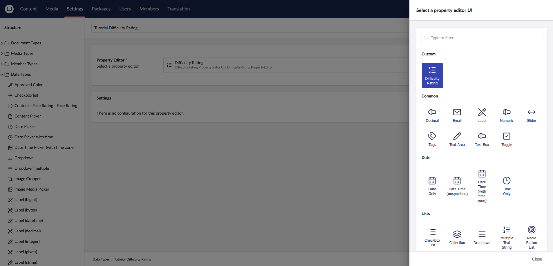
When I was developing my own property editor, this particular step gave me quite a bit of trouble. After a bit of research and some trial and error, I managed to get the editor to appear correctly in the backoffice but saving it produced an unhelpfully generic error in the browsers dev console.
The reason is that Umbraco requires a class extending Umbraco.Cms.Core.PropertyEditors.DataEditor in order to register the data type on the server side. It's a very lightweight file, simply linking the alias and defining the ValueType.
To resolve this, create a new class within your Umbraco web project and add the following code into it:
using Umbraco.Cms.Core.PropertyEditors;

[DataEditor(alias: "DifficultyRating.PropertyEditor", ValueType = ValueTypes.Text)]
public class DifficultyRatingPropertyEditor : DataEditor
{
    public DifficultyRatingPropertyEditor(IDataValueEditorFactory dataValueEditorFactory): base(dataValueEditorFactory)
    {
    }
}
This new class will now allow you to create and save new property editors using your data type!
At this point, we've created a very basic property editor. It can be added to a document type in Umbraco and will render as a simple text field. In its current form, however, saving a page with this editor will not retain the value, nor will it be retrievable on the front end.
In this section, we will expand the render() method in the Typescript file we created earlier.
Within the DifficultyRatingEditorElement class, add the following variable and functions. These will handle setting the value of the editor and determining the correct colour when hovering over the difficulty dots.
@state()
private _hoverValue = 0;
public value = 0;

private _setValue(value: number) {
	value = value;
	this._hoverValue = 0;
	this.dispatchEvent(new Event("change"));
}

private _getColour(index: number) {
    const green = 'rgb(60, 180, 75)';
    const orange = 'rgb(255, 170, 0)';
    const red = 'rgb(220, 60, 60)';

    if (index <= 3) {
        return green;
    } else if (index <= 6) {
        return orange;
    } else {
        return red;
    }
}
Next, we need to add some CSS to your property editor so that it shows up correctly in the backoffice. For now, the aim is simply to get things working rather than make it perfect. To do this, add a styles variable and place the following styles directly beneath the _getColour method.
static styles = css`
    .difficulty-wrapper {
      display: flex;
      flex-direction: column;
      gap: 6px;
    }

    .label {
      font-size: 12px;
      color: var(--uui-color-text-alt);
    }

    .dots {
      display: flex;
      gap: 8px;
      cursor: pointer;
    }

    .dot {
      width: 26px;
      height: 26px;
      border-radius: 50%;
      background: #ddd;
      display: flex;
      align-items: center;
      justify-content: center;
      font-size: 12px;
      font-weight: 600;
      color: #fff;
      transition:
        transform 0.15s ease,
        background 0.15s ease;
    }

    .dot.active {
      transform: scale(1.1);
    }

    .dot:hover {
      transform: scale(1.2);
    }

    .value {
      font-size: 11px;
      color: var(--uui-color-text-alt);
    }
  `;
This will style the circles into a neat, horizontal row, ready for the user to interact with.
Finally, we need to update the render() method so that it actually outputs the ten <span> elements, along with the necessary structure and event handlers to make the styling and interaction work as expected.
protected render() {
const activeValue = this._hoverValue || this.value || 0;
return html`
<div class="difficulty-wrapper">
<div class="dots">
${Array.from({ length: 10 }, (_, i) => {
const index = i + 1;
const active = index <= activeValue;
return html`
<span
class="dot ${active ? "active" : ""}"
style=${active ? `background:${this._getColour(i)}` : ""}
@mouseenter=${() => (this._hoverValue = index)}
@mouseleave=${() => (this._hoverValue = 0)}
@click=${() => this._setValue(index)}
title=${`Rate ${index} / 10`}
>
${index}
</span>
`;
})}
</div>
</div>
`;
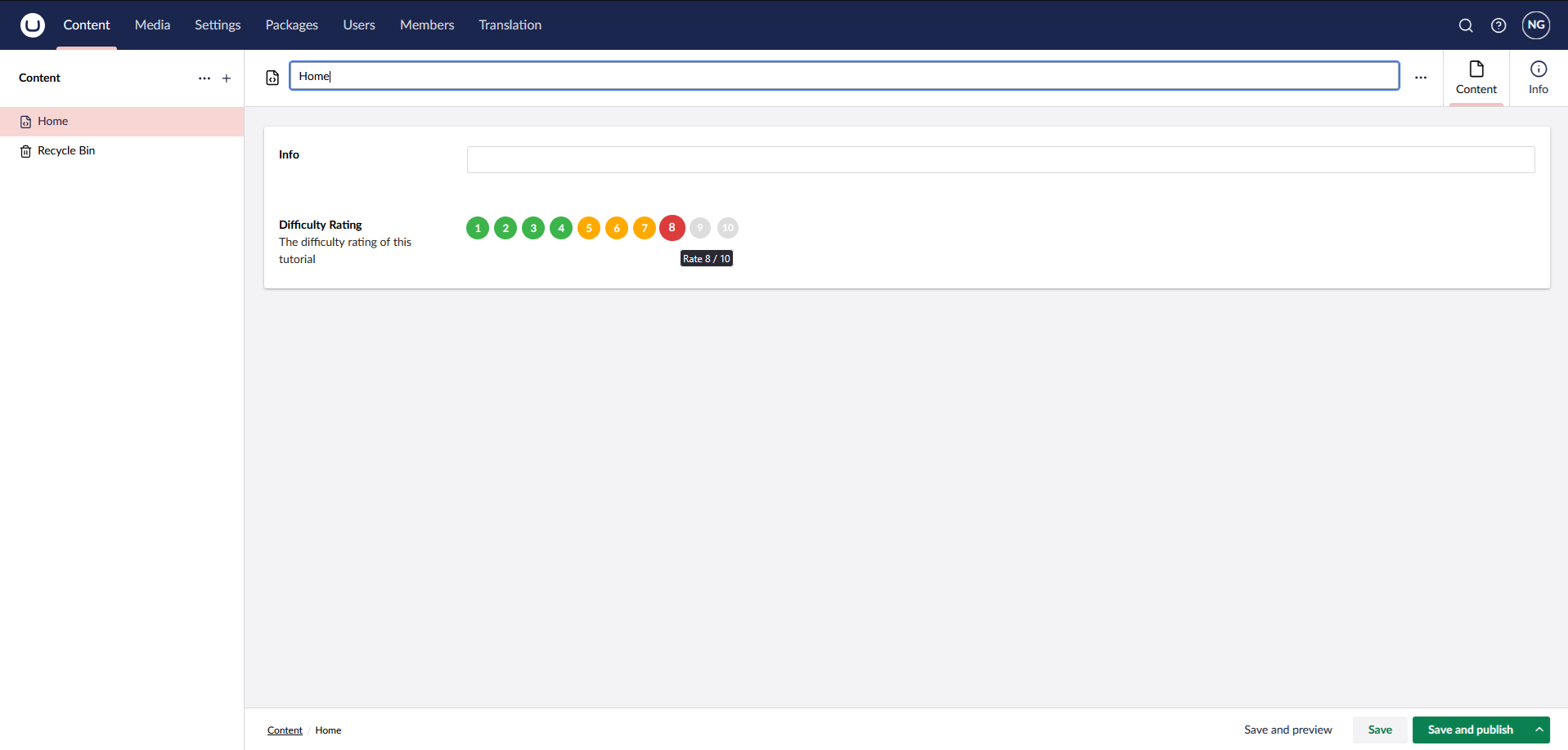
}Building the project again at this stage will output all the required files into your Umbraco project. You can now add the property editor to a document type and see a selectable rating made up of ten coloured dots, numbered from one to ten. As you interact with them, they will change colour to reflect the selected difficulty.
Crucially, once the content node is saved and revisited, the selected value is now retained - confirming that the editor is now fully wired up and ready to be used on the front end!
For reference, here is the complete difficulty-editor.ts file. If anything doesn't look quite right in the version you've ended up with, this should help clear things up.
import { html, css } from 'lit';
import { customElement, state } from '@umbraco-cms/backoffice/external/lit';
import { UmbLitElement } from '@umbraco-cms/backoffice/lit-element';
import type { UmbPropertyEditorUiElement } from '@umbraco-cms/backoffice/property-editor';

@customElement('difficulty-rating')
export class DifficultyRatingEditorElement extends UmbLitElement implements UmbPropertyEditorUiElement {
  @state()
  private _hoverValue = 0;

  public value = 0;

  private _setValue(value: number) {
    this.value = value;
    this._hoverValue = 0;
    this.dispatchEvent(new Event("change"));
  }

  private _getColour(index: number) {
      const green = 'rgb(60, 180, 75)';
      const orange = 'rgb(255, 170, 0)';
      const red = 'rgb(220, 60, 60)';

      if (index <= 3) {
          return green;
      } else if (index <= 6) {
          return orange;
      } else {
          return red;
      }
  }

  static styles = css`
    .difficulty-wrapper {
      display: flex;
      flex-direction: column;
      gap: 6px;
    }

    .label {
      font-size: 12px;
      color: var(--uui-color-text-alt);
    }

    .dots {
      display: flex;
      gap: 8px;
      cursor: pointer;
    }

    .dot {
      width: 26px;
      height: 26px;
      border-radius: 50%;
      background: #ddd;
      display: flex;
      align-items: center;
      justify-content: center;
      font-size: 12px;
      font-weight: 600;
      color: #fff;

      transition:
        transform 0.15s ease,
        background 0.15s ease;
    }

    .dot.active {
      transform: scale(1.1);
    }

    .dot:hover {
      transform: scale(1.2);
    }

    .value {
      font-size: 11px;
      color: var(--uui-color-text-alt);
    }
  `;

  protected render() {
    const activeValue = this._hoverValue || this.value || 0;

    return html`
      <div class="difficulty-wrapper">
        <div class="dots">
          ${Array.from({ length: 10 }, (_, i) => {
            const index = i + 1;
            const active = index <= activeValue;

            return html`
              <span
                class="dot ${active ? "active" : ""}"
                style=${active ? `background:${this._getColour(i)}` : ""}
                @mouseenter=${() => (this._hoverValue = index)}
                @mouseleave=${() => (this._hoverValue = 0)}
                @click=${() => this._setValue(index)}
                title=${`Rate ${index} / 10`}
              >
                ${index}
              </span>
            `;
          })}
        </div>
      </div>
    `;
  }
}

export const element = DifficultyRatingEditorElement;As this is likely to be a familiar exercise, I've written a deliberately simple example of how the value can be rendered on the front end of your website. The property editor stores a number between one and ten, and like any other property in Umbraco, this value is accessed via its alias.
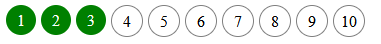
Model.Value<int>("difficultyRating")Use the code below to render ten dots, which will highlight in green to indicate the value selected in the backoffice. You can observe the change by updated the value in Umbraco and refreshing the content page.
@using Umbraco.Cms.Web.Common.PublishedModels;
@inherits Umbraco.Cms.Web.Common.Views.UmbracoViewPage
@{
	Layout = null;
}

@if (Model.HasValue("difficultyRating")) {
	var difficulty = Model.Value<int>("difficultyRating");

	<div style="display: flex; flex-direction: row; gap: 5px">
		@for(int i = 1; i <= 10; i++)
		{
			<span class="dot @(i > difficulty ? "inactive" : "")">@i</span>
		}
	</div>
}

<style>
	span.dot {
		display: flex;
		align-items: center;
		justify-content: center;
		color: white;
		background-color: green;
		height: 30px;
		width: 30px;
		border-radius: 50%;
	}

	span.inactive {
		background-color: white;
		border: 1px solid grey;
		color: black;
	}
</style>
There we have it. By following these steps, you now have a fully functioning difficulty rating property editor in Umbraco. Whilst this example has been somewhat niche, I wanted to develop a truly custom property editor to show you what can be done in Umbraco.
The same principles will apply to a more complex editor, dashboard, or any other Umbraco package that you wish to create. The important thing is that the editor is now properly wired up, both in the backoffice and on the front end, giving you a solid example to build on.