Introduction
We have seen a growing need from clients to help them make their Umbraco websites meet accessibility standards and subsequently, web accessibility is now a hot topic buzzing around our office. Learning about web accessibility introduced surprises, such as how adaptable some people must become in order to navigate the web and the potential cost for a client to make an existing website accessible.
In this article, we will take a closer look at defining web accessibility and how it impacts our Umbraco clients. We will also show how you can make Umbraco websites more accessible during an initial build, lessening the future impact for clients and allowing more people to access a website.
What is web accessibility?
Web accessibility is an inclusive practice that allows people to perceive, understand, navigate and interact with a website regardless of their disability. To put it simply, we want to design and build websites that allow everyone to have access. Currently, the World Wide Web Consortium (W3C) Web Accessibility Initiative (WAI) has developed international standards for web accessibility. They publish and make available the Web Content Accessibility Guideline (WCAG) which is a technical standard. The current version is WCAG 2.0; a working draft of WCAG 2.l is anticipated to be released in 2018.
To put it simply, we want to design and build websites that allow everyone to have access.
The WCAG 2.0 standard has 12 guidelines and each guideline has success criteria for 3 levels:
- Level A: The most basic implementation of Web Accessibility
- Level AA: This level addresses the biggest and most common barriers for disabled users
- Level AAA: The highest level of Web Accessibility
Although WCAG 2.0 is recognized as the international standard for web accessibility, meeting the highest level (Level AAA) does not guarantee that every person with any combination of disabilities will be able to access your website. The technical standard is maintained and updated routinely to allow for the most inclusive practices possible.
Now that you are familiar with what Web Accessibility is, we will talk a little bit about disabilities and how some people may navigate and interact with your website.
Disabilities and challenges with accessing the web
We researched to learn more about the types of disabilities and users that are navigating the web. Specifically we wanted to learn what roadblocks people with disabilities may encounter when navigating a website.
We found that the W3C Web Accessibility Initiative provides some excellent resources to help you learn about the types of disabilities, the challenge(s) disabilities present when accessing the web, and the assistive devices visitors may be using.
Here are some interesting facts that we learned:
- Disabilities may be temporary or long term
- A person with temporary disabilities may not know about assistive technology or what their specific web accessibility needs are.
- Disabilities are diverse
- These include visual, auditory, physical, speech, cognitive, language, learning, and neurological disabilities.
- The types of assistive technology disabled people use will vary especially if they have more than one disability.
Disabled people may not be able to afford assistive technology
- Disabled people may not be able to afford assistive technology
- Certain types of assistive technology can be quite expensive.
- Testing with a combination of free and licensed assistive technology will help you better understand the user experience.
- Disabled users may use one or more of the following when visiting your site
- Screen readers
- Braille displays
- Keyboard use only (such as the tab key to jump from link to link)
- Mobile device accessibility features
- Speech recognition software
- Adjusting browser settings such as increasing text size or adjusting color contrast
There are many resources available to educate yourself about disabilities and challenges disabled people encounter when accessing your website. We encourage you to use this list as simply a starting point.
Next, we'll discuss how you can audit your website using assistive technology.
How do I evaluate whether a website meets accessibility standards?
Before a website can be evaluated for accessibility, it is important to establish the scope of the audit first. Most of our clients have requested help with achieving WCAG 2.0 Level AA but we have also audited at Level AAA. The difference between these levels can be significant, depending upon the website, so it is important to figure out what level of accessibility your client needs.
Having audited websites for accessibility, we propose an approach that combines manual and automated testing. We have found that not all automated tools catch all the issues and each tool may be more sensitive to certain requirements than others. For example, auditing interactive elements with an automated tool is less than ideal.
...it is important to figure out what level of accessibility your client needs.
Automated Testing
For automated testing, there are several nicely developed and free web accessibility tools available; many of these can be added as extensions into your web browser and require one click to begin the audit. So far, our two favorite tools are:
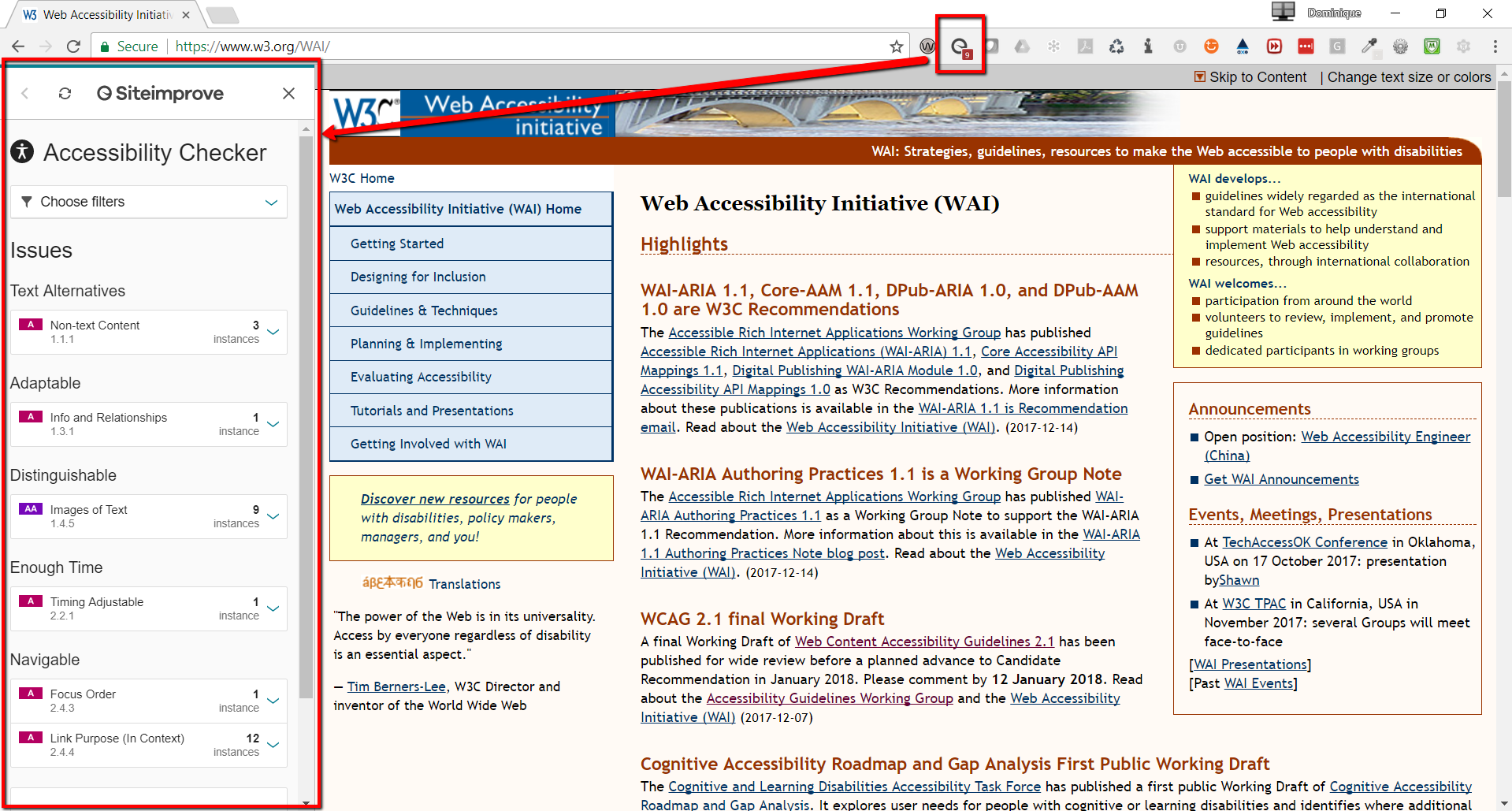
In this example, we will be referring to the Siteimprove Chrome Extension. Once this has been added to your browser, navigate to your website and then click on the browser extension. You will notice a left-handed menu pops open:

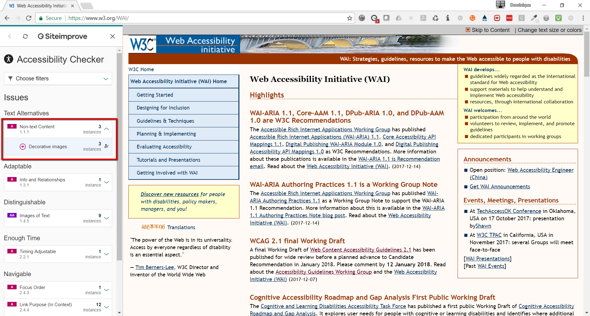
If you click on any Issue in the menu, it will expand to show you more details. For example, clicking on "Non-text Content" reveals 3 instances of "Decorative images"

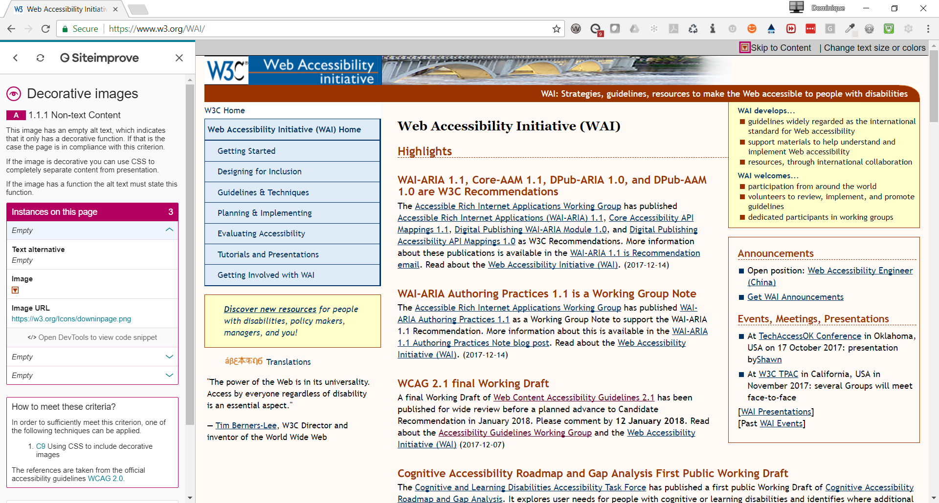
Clicking on "Decorative images" allows you to drill down to the specific element. The cool thing about this accessibility checker is that it provides brief information from the WCAG 2.0 standards to help you understand why this is an issue.

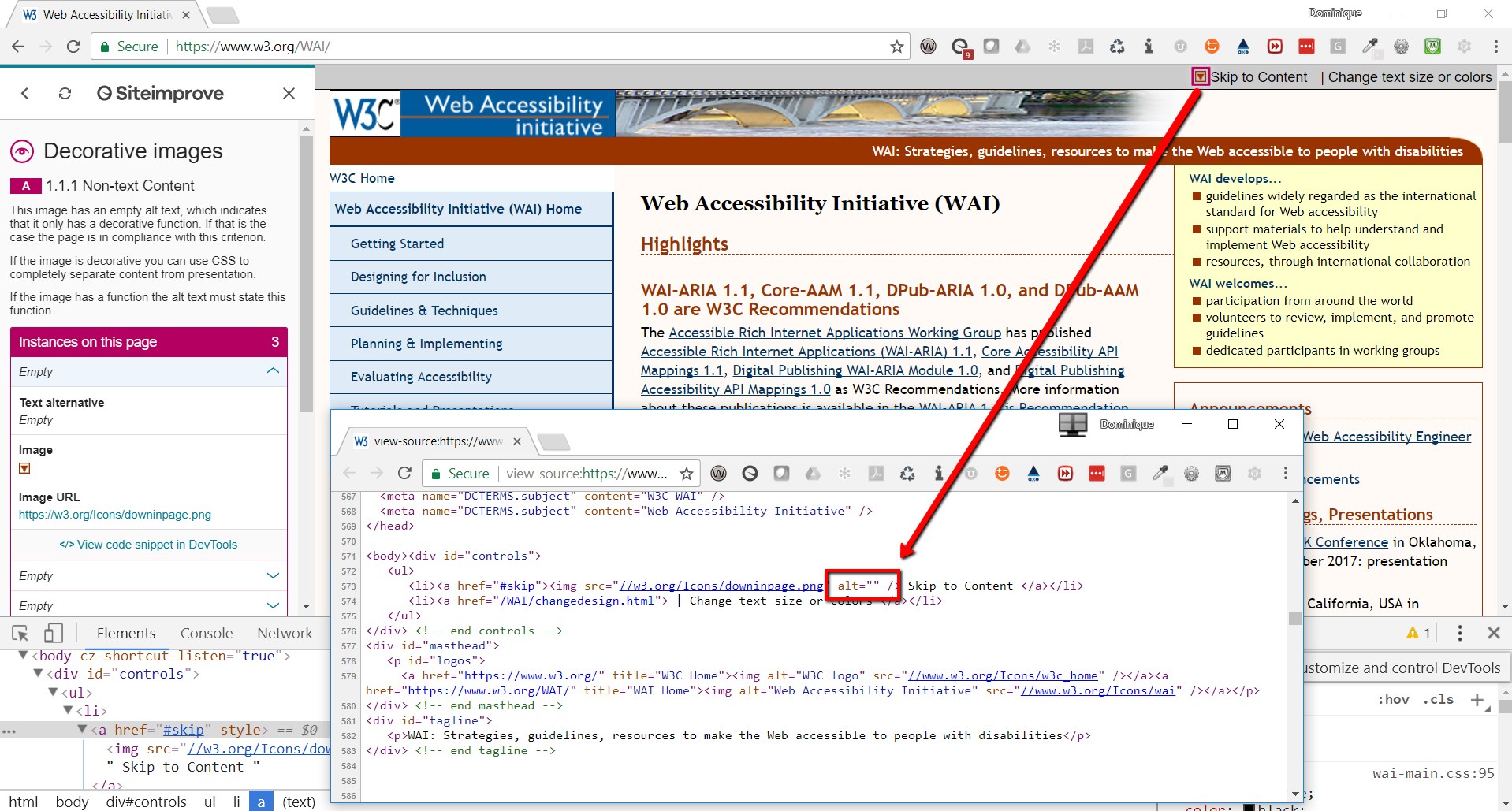
With this specific issue, the Siteimprove accessibility checker knows that an image has a blank or null alternative text (i.e. alt=""). In this situation, having a null alt text is not an issue since the image is used purely for decoration.

Screen readers are another type of assistive technology people may be using when visiting your site. So far, our two favorites to recommend are:
Manual Testing
For manual testing, the ideal scenario would be to employ as many disabled users as you can in the auditing process. The one downside to this approach is that it can be cost prohibitive for many organizations so the next best thing is to perform the testing yourself.
Below are some ways to manually audit for accessibility. Keep in mind that depending upon which WCAG 2.0 level your client needs to meet, some of these may not be applicable:
- Start with the WCAG 2.0 technical standards
- The full version of the WCAG 2.0 Technical Standards
- A quick reference version of the WCAG 2.0 Technical Standards
- If you need a more formal auditing and reporting tool, check out this WCAG 2.0 Audit and Report Tool
- Use the WebAIM WCAG 2.0 checklist
- This checklist is an easier way to learn how to audit for accessibility as published by WebAIM
- This checklist does not replace the WCAG 2.0 technical standards
- Navigate through the website using only your keyboard
- Turn on a screen reader and navigate through the site, listening to how your content is read
To summarize, the most important part of auditing a website is to first know which WCAG 2.0 Level your client is required to meet. Once that is determined, the audit should consist of both manual and automatic testing.
In the next section, we recommend techniques that should be included with each new Umbraco build.
How do I setup Umbraco so that content will meet accessibility standards?
Most importantly, a website with at least basic web accessible features allows more people access to the website.
When creating new sites, we recommend adding at least the minimum web accessible functionality and design; it does not add much more cost or time when creating a new website. Including the minimum amount of web accessibility will help reduce costs in the future if web accessibility does become a requirement. Most importantly, a website with at least basic web accessible features allows more people access to the website.
In the following sections, we group web accessible functionality and design recommendations for inclusion in any new website. The following recommendations are not specific to any one particular WCAG 2.0 level.
Color Contrast
It is important to ensure the contrast between text and a background color or image is sufficient for everyone, including those with disabilities. If you are designing a site, try to keep the contrast ratio at 4.5:1 for normal text.
Also, when using color to convey meaning, ensure you have another non-color way to communicate that same meaning. For example, in the below image, the chart on the left may look like the chart on the right to someone who is color blind.

A simple way to remedy this could be to change the line style in order for someone with color blindness to differentiate between the data sets.

Keep in mind that contrast ratio applies to all combinations of background color, background image, text color, and text hover color. Also, if the Umbraco grid editor is being used, consider proposing color combinations that meet a 4.5:1 contrast ratio.
Headings
Headings are used to convey structural information about web content and are used by assistive technology to give people context about a website. Out-of-the-box, Umbraco's rich-text editors enable editors to easily control how headings are implemented.
When we create additional Umbraco properties that will be used as headings, we recommend these guidelines:
- Headings (H1, H2, H3, H4, H5, H6) should be properly nested
- Correctly nested headings:
- Heading 3
- Heading 4
- Heading 5
- Incorrectly nested headings:
- Heading 4
- Heading 5
- Heading 3
- Correctly nested headings:
- Each page should have one concise H1
- Text may not be styled to look like a heading
- If text looks like a heading but does not have a heading tag, people using assistive technology will not recognize the non-heading text as a structural element
Images
Screen readers will read the alternative text (alt text) of an image aloud. For this reason, alt text is required for every image throughout a site and should be descriptive. If an image is purely decorative, the alt text should be left blank and the Screen Reader will simply ignore or skip past the image.
Descriptive alt text:
<img src="http://dev.catsrock.proworks.io/media/1069/company-logo.png" alt="Cats Rock Logo">Alt text for a decorative image:
<img src="http://dev.catsrock.proworks.io/images/css/arrow-down.png" alt="">When building a new Umbraco site, we recommend adding a text property to the Image MediaType with the alias altText. Configure the Image to always use the altText property as its alt tag.
Tables
Assistive technology will use HTML markup for tables to help people understand the structure and context of a table. For example, screen readers can read the header row or header column when reading table data in order to provide a visitor with enough context.
Umbraco's rich-text editor (RTE) has the built-in functionality to properly define header rows, header columns, and data cells. You can guide editors on how to create tables using the built-in table builder from the RTE menu.
In this table builder, deprecated inline styles such as border=0 are added to the markup by default. Users of assistive technology who need to apply their own stylesheets to webpages face the potential of having their stylesheets overwritten by these inline styles. Because of this issue you should disallow certain attributes. We can do so by modifying the tinyMceConfig.config file as follows:
<validElements>
<!-- Disallow all table attributes except for class and id -->
<-table[class|id]>
</validElements>
Search
When developing search functionality within a site, the WCAG 2.0 techniques you use will come from different guidelines. If you must achieve a specific conformance level, you will want to ensure all search functionality meets those specific WCAG 2.0 guidelines.
Here are some minimum requirements that you should implement today when configuring a new search functionality for your clients:
- All images must have alternative text:
- Descriptive alt text for thumbnails in search results
- Null alt text for purely decorative images
- Description of functionality should be placed in the alt text tag for images that are hyperlinks or perform other functional aspects
- Form controls are labeled using the <label> element
- Content is not re-organized by CSS
- Ensure color contrast is sufficient for all buttons and placeholder text
- Ensure elements are highlighted when they are focused on or selected
- Do not remove outline with Outline: 0 or Outline: none
Content Order and Look
The next article in this accessibility series will go more into the technical details of how your team can design your site so that accessibility is built in. But there are many simple things that developers and designers can do when writing the markup for your site that will make the accessible experience better.
- Include outline styles
- By default, browsers include an outline on links that are focused on (the :focus pseudo-class)
- This visual indicator will highlight links as people navigate your website with a keyboard
- This is an important element for keyboard users and alternatives should be considered before removing this important functionality
- Keep content in a logical order
- Screen readers announce content on a page in the order that the DOM presents it
- Reordering that visually (with CSS) means assistive technology will announce content in a different order than way it is presented visually
- Use proper HTML tags and roles and use native HTML elements instead of creating custom ones when possible
- Native HTML elements come with built-in properties that assistive technologies can access to provide more information about the content
- Only use an <a> tag when there is actually a link. For example, don't use it for a button that only opens a modal window
- Use landmark tags such as <header>, <main> and <footer> when appropriate so assistive technology will announce certain areas as the "header", "footer", etc
- Include skip links
- Keyboard only users need a way to skip repeated content (e.g. navigation) on a page
- Skipping repeated content can be achieved by including anchor links
- Wrap the anchor links in a <div role="navigation"> so assistive technology knows to announce it as a navigation element
<!-- Allows a keyboard user to skip directly to the main content and bypass elements such as the navigation-->
<div role="navigation">
    <a href="#content" class="skip-links" aria-label="Skip to Main Content">Skip to main content</a>
</div>
Conclusion
Web accessibility may or may not be a requirement for your client today but including some basic web accessible design and functionality will allow more people access to your site. The key is to include these techniques when building a new Umbraco website.
Let's make building an accessible site become as commonplace and second-nature as building a site to be responsive!

