
Hey folks - my name is Chriztian and I'm here to tell you about how I fumble my way through developing Umbraco sites on my trusty old MacBook Pro. (I had switched to the Mac long before I ever knew about Umbraco, so I never really pondered switching to Windows, even though I had absolutely no way of running the sites locally for debugging etc.)
I've always enjoyed reading about how others do something I also do, whether it's three- vs. four-finger scales on the guitar or structuring their computer's desktop (bump up the icons to an insane size - can't fit so many then, right?) so I hope some of you get an "aha - didn't think of that..." moment while reading this article and get inspired to try something different.
I'm a frontend person
I was never really interested in all "the server stuff" (setting up permissions, the database, the database user accounts etc.) - the parts of development I really love are the parts that deal with HTML & CSS; with JavaScript for interactivity & behaviors.
Over the years I’ve found a process/rhythm for my frontend development that’s been influenced by many different approaches, and currently I’ve dubbed my process “CPL” (pronounced “couple”) - the letters stand for Components, Panels & Layouts. See, that's actually three, not a couple - figures...
Components are the smaller chunks, like a button, a header or a navigation list.
Panels are very often just a wrapper for a number of components, - for example, a typical Footer Panel could contain Header, TextContent and NavigationList components.
Layouts are full pages where panels and components flow by next to each other.
Every component has its own folder inside the src/components/ folder, e.g. src/components/linkbutton/, wherein we find a .kit (HTML) file and a .less (CSS) file. Maybe a .js file but probably also a .cshtml file, which we’ll get back to later.
The thing that really makes all of this work for me is an app called CodeKit.
CodeKit
This gem of an app handles so many things that are usually handled by your package/bundle manager of choice, e.g.:
- Build the CSS from all the .less files
- Build the JS from all the .js files
- Build all of the prototype HTML files from the .kit files
- Serve the site
- Reload any browsers when a file changes (animating the CSS changes so you can easily see what changed)
I'm pretty sure this app alone has already saved me years of npm install-woes. (It can actually handle your npm stuff as well, but I don't use that).
the .kit file
Kit is basically HTML with includes and variables. That’s it, no looping or control statements of any kind. But it enables doing something like this to test the robustness of a component:
First, here’s the _linkbutton.kit file:
<a href="#somewhere” class="linkbutton <!-- $buttonClass? -->"><!-- $buttonLabel? --></a>Yes. You saw it too, didn't you? An HTML comment inside an attribute??? I know, that did take about a year or so for me to accept, but now I'm fine with it, as I know it's because it makes it insanely fast for CodeKit to process (no tokenization or complex language parsing needed).
Then what I also have is a long "components" file where I include all of these, to see how stuff breaks:
<!-- $buttonLabel: Click me! -->
<!-- $buttonClass: nil -->
<!-- @include “components/linkbutton/linkbutton” -->
...
<!-- $buttonLabel: We’ve updated our Terms & Conditions -->
<!-- $buttonClass: alt
<!-- @include “components/linkbutton/linkbutton” -->
Now I’m able to see just how well that longer button breaks (or if it breaks at all).
And CodeKit keeps that page updated whenever a component changes.
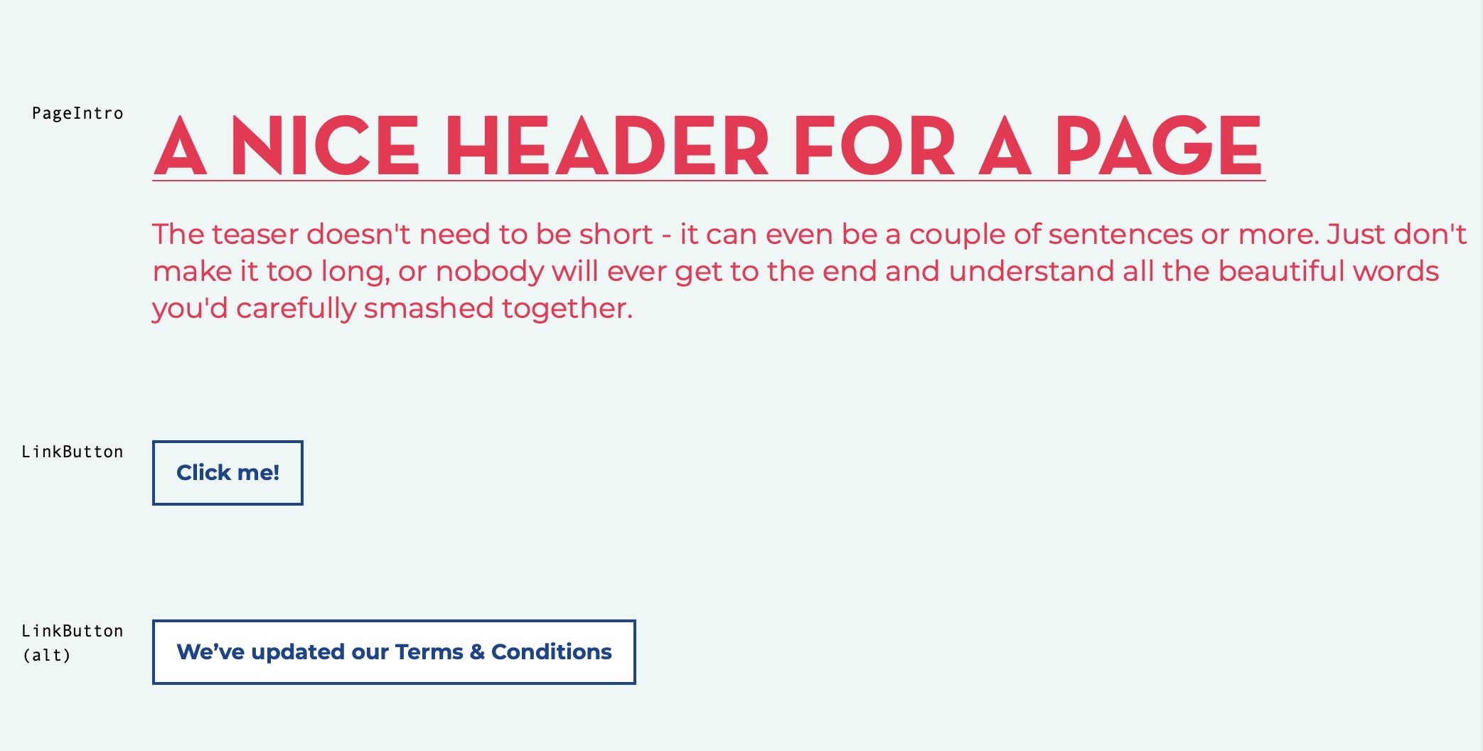
A couple of LinkButtons on the "componentized" page in the *regular* sizeclass.
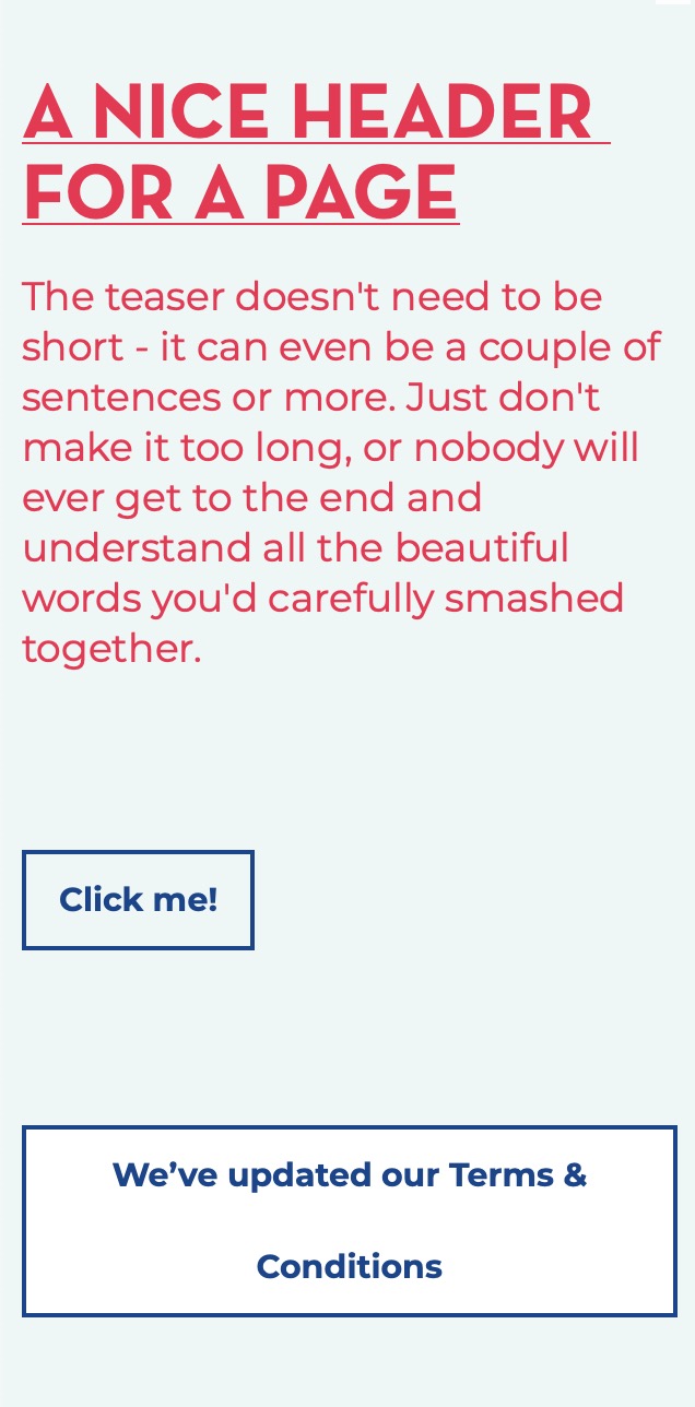
A couple of LinkButtons on the "componentized" page in the *compact* sizeclass
You can read more about the Kit format on CodeKit's webpage.
The .less file
I stumbled upon Less first, but I'm sure Sass has the same features that I use Less for, specifically:
- Imports (i.e., the kind that results in a single CSS file - not CSS imports that are separate HTTP requests)
- Variables (e.g. for brand colors, animation settings etc.) - these are compile-time variables, mind you; not runtime variables (which I can use CSS Custom Properties for, but that’s a whole ‘nother discussion)
- Mixins - for abstracting styles into something that can be used in more places and have a meaningful name.
- Nesting - I don’t nest to insane levels, but it’s nice to be able to “scope” a component and A) Have it be easy to read, and B) Not have to add complicated classes to every single element inside out of fear that something will bleed through to “the other side”.
In our sample here, the linkbutton.less file exhibits points 2, 3 & 4:
.linkbutton {
	.linkbuttonStyles();

	&.alt {
		background-color: @whiteish;
	}
}
Note: I usually vote against naming color variables after the actual color (because of the likelihood of near-launch changes ending up in a variable called @red actually having the color of dark green) but I make an exception for "white" and "black", specifically. (I name them @whiteish and @blackish just in case the designer decides to tweak them a tiny bit.)
The .js file
I was actually using CoffeeScript for quite many years, but now that ES6 has adopted so many of its features, I'm back to JavaScript again. (Why yes, CodeKit handled compiling CoffeScript on the fly for me, and now it's just doing "Babel transpilation" instead).
Now, the LinkButton uses CSS transitions for its hover + focus interaction so it doesn't have a .js file. But let's look at one for a Slider Panel instead:
import Swiper from '../../../vendor/swiper/swiper.esm.browser.bundle'

export default function initialize(selector, options) {
	const swiper = new Swiper(selector, options)
}
In the main.js file I pick up the exported initializer and call it when called upon (in this case when the page has loaded):
import initializeSliderPanel from '../panels/slider-panel/slider-panel'

document.addEventListener('DOMContentLoaded', (event) => {
	initializeSliderPanel('.swiper-container', {
		pagination: {
			el: '.swiper-pagination',
			clickable: true
		},

		navigation: {
			nextEl: '.swiper-button-next',
			prevEl: '.swiper-button-prev'
		}
	})
}
This way I've been able to keep the component-specific files together – but I was always missing one specific file from that equation...
The .cshtml file
This is Razor — wöohoö :) I'll save my personal quibbles with Razor for a future installment in the continuing saga, but suffice to say it's been a bumpy ride for me, from time to time.
The Razor file shares its name with the DocumentTypeAlias of the block it's rendering, so let's have a look at that PageIntro component from the screenshots above — it'll have a razor file called PageIntroBlock.cshtml:
@inherits Umbraco.Web.Mvc.UmbracoViewPage<PageIntroBlock>
@{
	var block = Model;

	var header = block.Header;
	var teaser = block.Intro;
}
<div class="pageheader">
	<h1>@(header)</h1>
	<p class="teaser">
		@(teaser)
	</p>
</div>
But I am getting ahead of myself — let's talk about them "blocks"...
Building Blocks
In Umbraco 7 we used this great package called Embedded Content Blocks for general page building. In Umbraco 8 we're using Nested Content (with the Nesting Contently addon) but the general setup is the same:
The Document Types tree has a folder called Blocks where the block types are created. They're all created without a template, their aliases all have the suffix Block as we saw with the PageIntro above. In Umbraco 8 they also need to have "Is an Element Type" checked on the Permissions tab for them to be used with Nested Content.
In the Partial Views tree there's a similar folder, named Blocks where every block type has a corresponding partial that knows how to render a block of said type.
The blocks are added to a Nested Content datatype so that they're available to build pages with. When rendering the blocks section, we pick up all the blocks and send them into this partial (Blocks/RenderBlocks.cshtml):
@inherits Umbraco.Web.Mvc.UmbracoViewPage<IEnumerable<IPublishedElement>>
@{
	var blocks = Model;
}
@if (blocks.Any()) {
	foreach (var block in blocks.Where(b => b.IsVisible())) {
		@Html.Partial("Blocks/" + block.ContentType.Alias, block)
	}
}
That, in turn, makes sure to find the appropriate partial for any given block, and because of some internal magic with types, the engine is able to hand the blocks to the partials as the typed models they are, so we're able to "just" use Models Builder syntax (block.PropertyName) instead of the not-so-readable generic block.Value<string>("propertyName") syntax.
This is as close as I will ever get to the magic of <xsl:apply-templates /> I guess :)
We're now able to rather easily add a new block (with new functionality) to the already existing set, without worrying about breaking existing pages.
Sometimes a block can just be a dummy placeholder (e.g. an EmployeeListBlock) or even a spacer.
Build & Deploy
While developing the frontend components, CodeKit continually compiles any changed files (or files that include them). It also runs a webserver to preview the files in, so that's where I'm able to see the various components and how they behave in mainly the regular and compact sizeclasses (by changing the size of the browser window).
(If the term sizeclasses confuse you, I have a repo that you can check out).
One neat trick I use on the components page, is that in a component's kit file, I add the contenteditable attribute where applicable, so I can tweak a header, a link label or even a paragraph right on the page when I'm viewing it (instead of doing it with the Devtools):
<div class="pageheader">
	<h1 contenteditable><!-- $header? --></h1>
	<p class="teaser" contenteditable>
		The teaser doesn’t need to be short - it can even be a couple of sentences or more [...]
	</p>
</div>
When I have a version that's ready to fly, I have a deploy script (shell script) that copies the relevant files from the build folder into the website folder, which is usually a {project}.Web folder next to the {project}.Frontend folder.
For the frontend setup there's also a repo to checkout, which includes the tiny component framework I use for listing the components on a single page with a clickable Table of Contents - it's called componentize and has its own repo as well.
I'd like to thank you for reading this - and by all means, feel free to bug me about any of this – I'm @greystate on Twitter.
End Credits
Nesting Contently is created by Nathan Woulfe, Embedded Content Blocks is by Rasmus John Pedersen