I bet we've all had to create a colour picker or theme picker in Umbraco at some point, and we probably all have our own way of doing it. Of course, there is the built in way using the Color Picker, but that is quite limited.
There are packages that you can install like Robert Foster's Spectrum Color Picker, but I don't think he kept that one going for modern versions of Umbraco.
A lot of the time, you want to display the colour to the editor, but in the front end you want to write a class name in the HTML.
For a couple of projects lately, I have gone with the approach that I would like to share in this article.
Here is what my Colour Theme Picker looks like, and in this article I will show you how you can build one of these yourself.
What we will build
This is a custom data type built using the Data List property editor in Contentment.
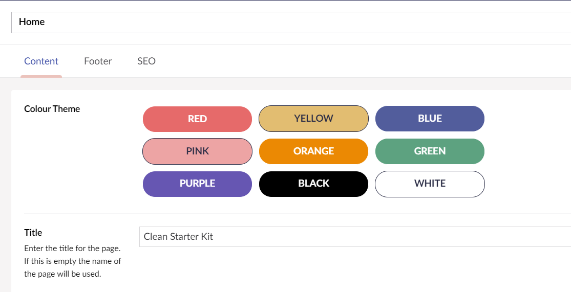
The theme colour picker property we are going to build.
The beauty of this approach is we can store the class name as the value of the property.
Then we can render out that property when setting the class on the front end.
So, we aren't outputting hard coded Hex values, we are just setting a class and all of the styles be done in the normal CSS files.

Setting the class using this property.
Follow along
If you would like to follow along, create a new folder on your computer, and copy the script from here and paste it in your command line.
Install Contentment
First of all, I install the package called Contentment. It's no secret that this is one of my favourite Umbraco Packages. What I like most about it, is the flexibility it gives you for creating custom data types in Umbraco without having to create them as separate packages of your own.
Create a new Data Type
With Contentment installed, you should be able to create a new data type using the Contentment Data List property editor.
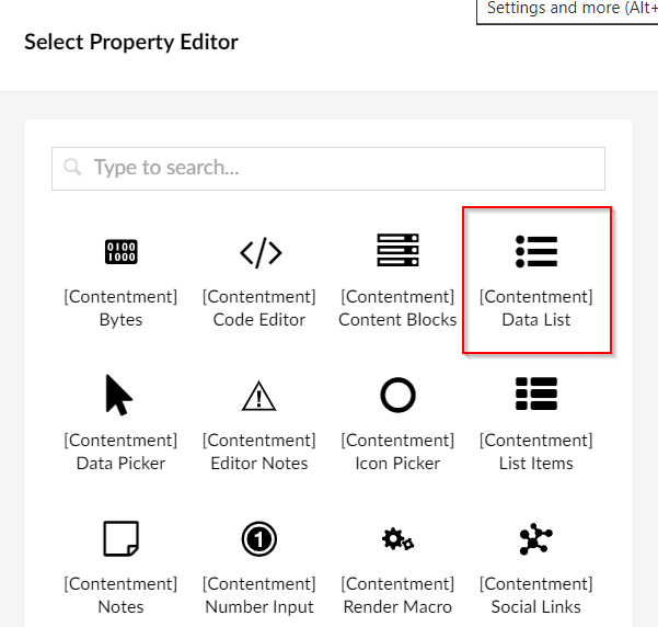
Choose the Contentment Data List Property Editor.
And give it a name. I like to put [DataList] at the beginning of the name. It's something I learned from Marc Goodson. It keeps the custom data types at the top of the Data Types list and tells you which property editor it is using.
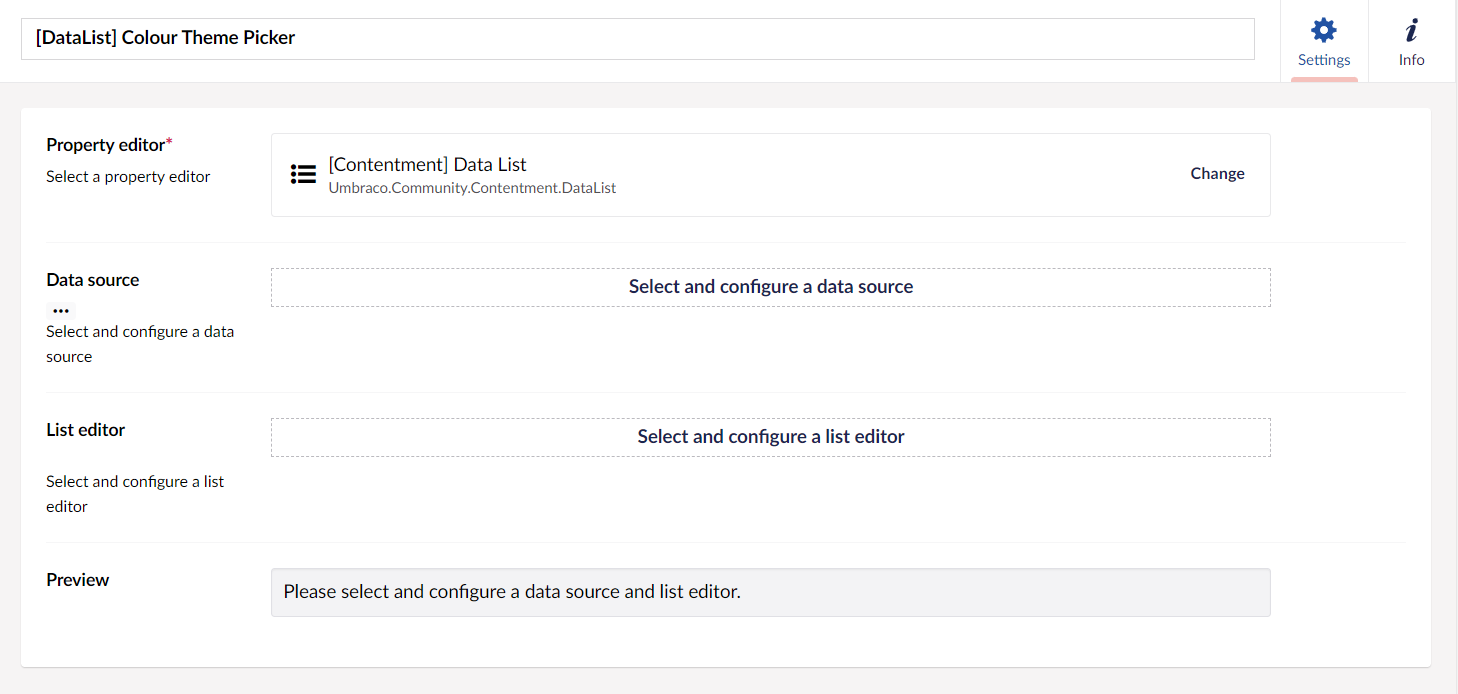
Select and configure your data source
Click on the button to select and configure your data source. There is a long list to choose from of predefined data sources, you should check them out. The one we want to use is called 'User-defined List'.
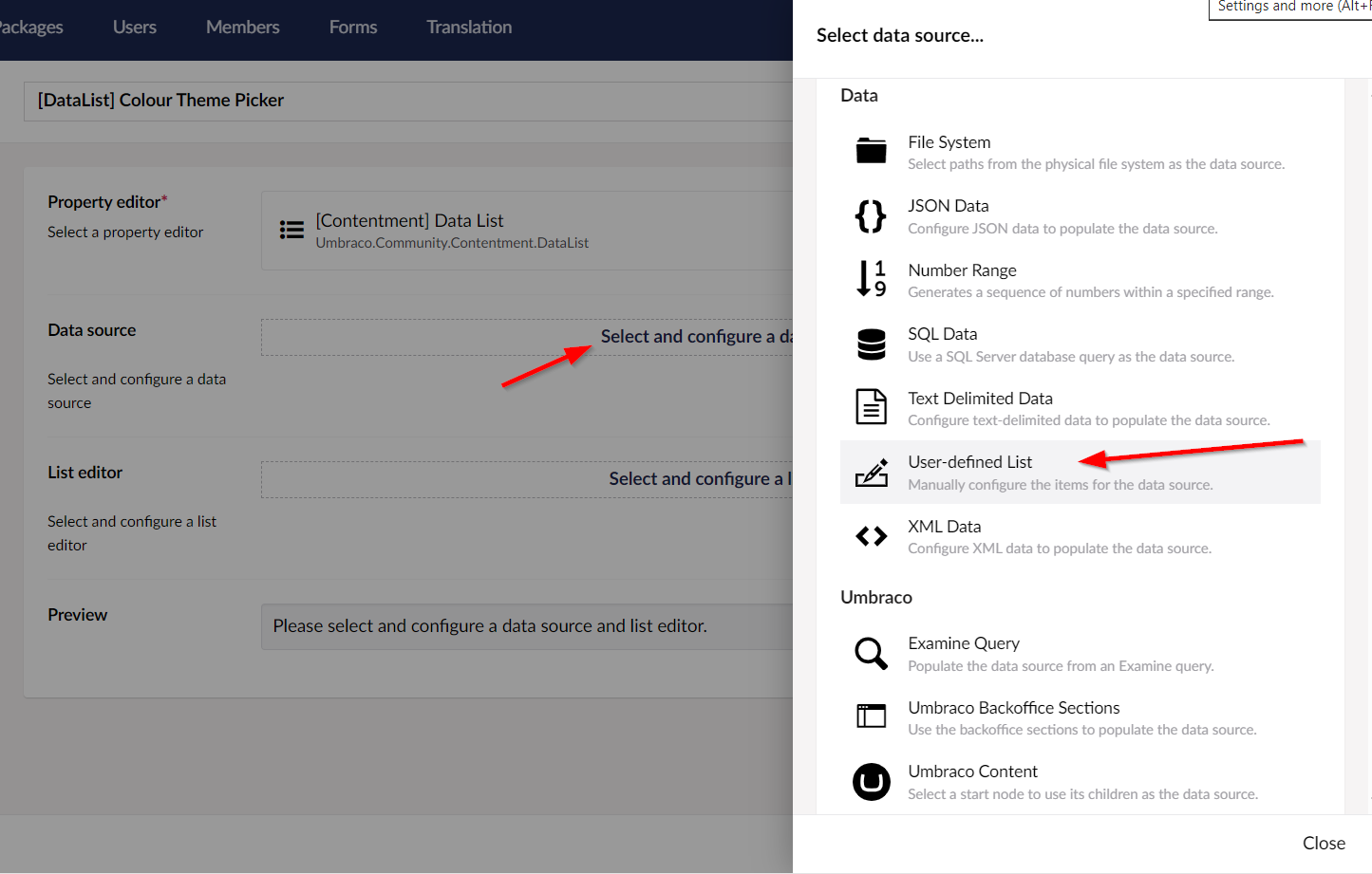
Click on advanced to paste in raw JSON.
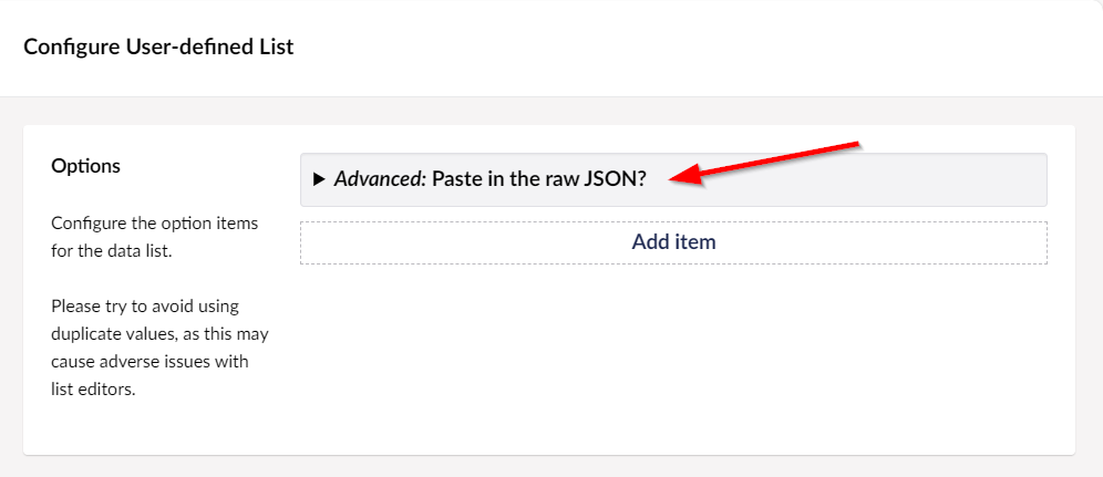
Click on advanced to paste in raw JSON.
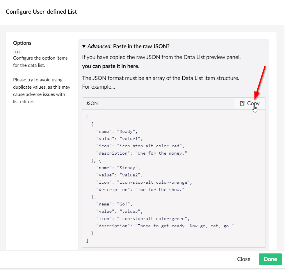
Copy the sample JSON.
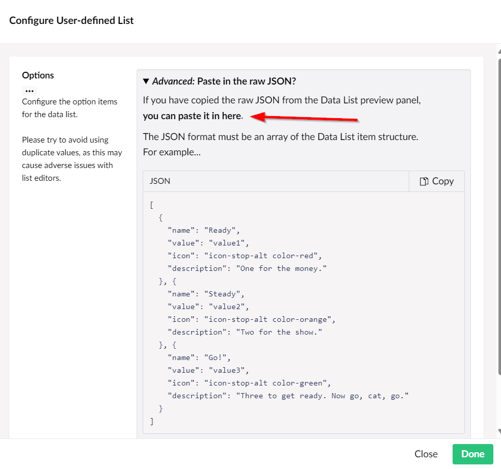
Click the link which says you can paste the JSON.
Delete what is added by default and paste in the copied JSON.
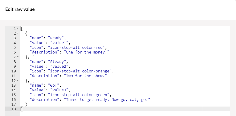
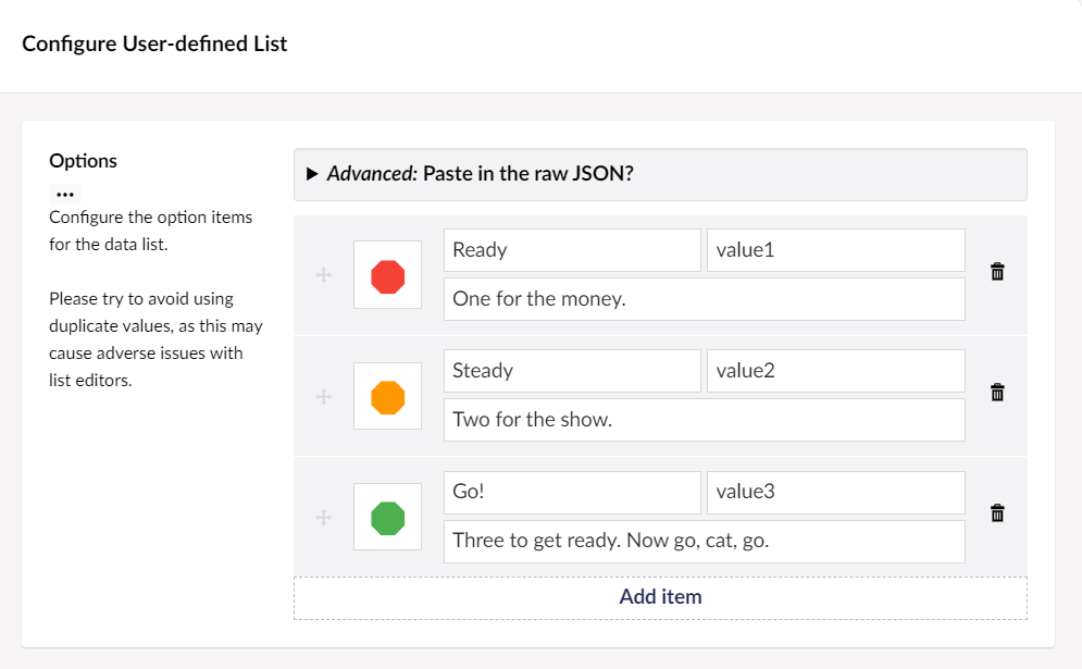
If you click on Done, Done, and then edit the data source again, you will see that the data you pasted created some values like this.
Customising the JSON
This is good, but we want to adapt this so we can have text for the label, text for the class name, the CSS Hex colour for the background colour and the CSS Hex colour for the text colour.
So here is the edited JSON. We are using name for the name, value for the CSS class name, icon for the background colour and description for the text colour.
[
  {
    "name": "Red",
    "value": "red",
    "icon": "#FB6068",
    "description": "#FFFFFF"
  },
  {
    "name": "Yellow",
    "value": "yellow",
    "icon": "#EDB872",
    "description": "#272E45"
  },
  {
    "name": "Blue",
    "value": "blue",
    "icon": "#48629B",
    "description": "#FFFFFF"
  },
  {
    "name": "Pink",
    "value": "pink",
    "icon": "#FCA0A3",
    "description": "#272E45"
  },
  {
    "name": "Orange",
    "value": "orange",
    "icon": "#FF7F00",
    "description": "#FFFFFF"
  },
  {
    "name": "Green",
    "value": "green",
    "icon": "#3EA381",
    "description": "#FFFFFF"
  },
  {
    "name": "Purple",
    "value": "purple",
    "icon": "#625DB1",
    "description": "#FFFFFF"
  },
  {
    "name": "Black",
    "value": "black",
    "icon": "#000000",
    "description": "#FFFFFF"
  },
  {
    "name": "White",
    "value": "white",
    "icon": "#FFFFFF",
    "description": "#272E45"
  }
]
Our new json values.
Templated List Editor
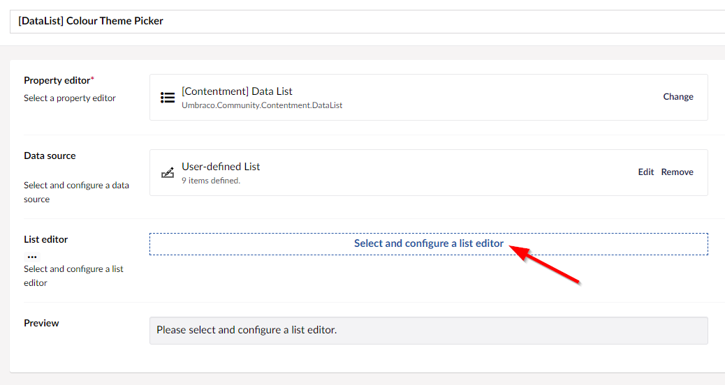
Now we need a way to render this data to the editor as a buttons, so we can select and configure a list editor.
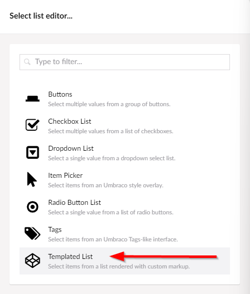
Choose the Templated List option.
We can now add an HTML template, and add an HTML attribute.
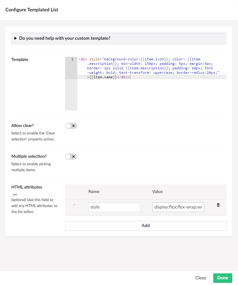
What the configured Templated List looks like.
Here is the code for the Template field:
<div style="background-color:{{item.icon}}; color: {{item.description}}; min-width: 150px; padding: 5px; margin:5px; border: 1px solid {{item.description}}; padding: 10px; font-weight: bold; text-transform: uppercase; border-radius:20px;">{{item.name}}</div>
Here is the value for the style HTML attribute:
<codedisplay:flex;flex-wrap:wrap;max-width:700px
Editor Preview
This is what the editor preview now looks like.

Use it on our home page
So lets save this data type and use it on our home page document type.
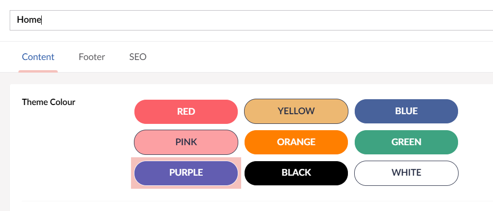
And lets update the Home Page View to render out the Theme Colour class choice.

Final Output HTML
And here is the final output in the HTML with the chose class name.

I'm not saying this is the only way or the best way, but it's a nice and easy, flexible way that can be achieved from within the backoffice.
