“Did I tell you my theory on why the user interfaces in Star Trek are so bad?” my co-worker Eric asked me the other day. We were enjoying a few minutes of down-time between meetings as part of a larger group. When I shook my head, he grinned.
“Okay, so remember the Eugenics Wars, where the human race was trying to overthrow Khan Noonien Singh and the other Augments that had formed tyrannical dictatorships and taken over the world? Picture this: the tide is turning in the war, but Starfleet is being beaten badly in a specific battle, and their only hope is for someone to sacrifice themselves to save the rest.”
 “The needs of the many outweighing the few,” I nodded. “Go on.”
“So at that moment, all of the UX Designers step forward, dressed in fancy purple uniforms, brandishing powerful weapons, and announce that they’ll hold off Khan and his men while the others escape. They sacrificed themselves, and Starfleet escaped and rallied to win the war. But the designers took all their knowledge with them, which is why all the interfaces sucked from then on.”
“And why there are no purple uniforms?” I asked.
“Wait a second, why would the UX Designers get their own uniform color?” another co-worker asked. “I mean, Science and Medicine have to share a color.”
“Oh well I can explain that,” I said. “UX Design would’ve been the ones called on to pick the colors in the first place, and if we get to pick who gets what, why would we share one?”
* * *
Barring the fact that Eric’s chronology was off and the Eugenics War took place well before Starfleet was founded, the headcanon that he’d developed called out a very important point about this TV series (or series of series) I have always loved: Starfleet’s user interfaces suck.
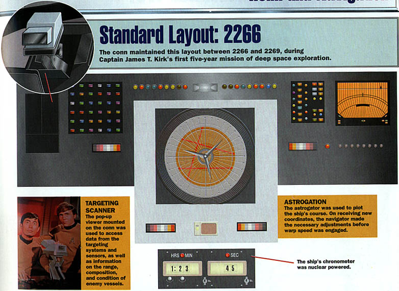
Let’s start with the interface on the helm of the USS Enterprise 1701 (from the original series). Star Trek The Magazine provided a picture in the July 1999 issue that showed a shared desk for the helmsman (left) and navigator (right) consisting of big blocky light-up buttons, lights, an “astrogation” navigation device, a chronometer, and a few other unlabeled doodads.

Interface on the help of the USS Enterprise 1701 (original series)
“Unlabeled” is the first clue there’s something seriously wrong. This interface has no navigation and wayfinding. The helmsman and navigator need to memorize the use of every control and interface, because there are no labels, no voice guidance, and no glove box in which to carry the Idiot’s Guide to Driving a Constitution-Class Starship.
Requiring hundreds of people to memorize multiple interfaces to pilot an expensive piece of interstellar equipment is an expensive training choice for Starfleet to make. Imagine how many weeks or months it took to learn which red button meant “fire torpedos” and which red button meant “turn starboard 90 degrees” and what happened if you got them confused.
It’s also an odd choice because it implies only certain kinds of people can run the helm. The interface requires users who can see light and color; light to see which buttons are lit up, and color to tell the buttons apart. That’s fine if all of your officers are humans (humanoids? I’m not sure what Vulcan vision differences are) with “typical” vision, but it’s a spaceship full of astrobiologically different people. Could a silicon-based Horta work these controls? Or for that matter, a male human with deuteranomaly?
These are interesting choices, but we won’t pick on the original series too much. After all, they foresaw the cell phone (communicator) and any number of other technological breakthroughs that nobody would’ve pictured we’d be using daily when it was created in 1966.
Besides, surely during the century between the original series, and the Next Generation, the system would be upgraded and the issues would be resolved, right? Surely the people smart enough to name the new system LCARS, the Library Computer Access Retrieval System, would also provide it with a clear and intuitive (at least for humans) interface, right?

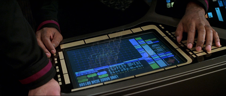
Interface from the Next Generation
Nope.
In Next Generation, Deep Space Nine, and Voyager, our heroes use a touchscreen filled with colorful shapes in specific palettes, still mostly lacking labels or instructions at any time. And there’s a voice command system so you can yell out “Computer!” and a command at any time, so long as you want everyone in a 40 foot radius to hear both your command and the response. Only the commanding officer, who had the Ready Room at their disposal, had any privacy when querying the system.
I know plenty of people who use VoiceOver on their iPhone or iPad, so it’s reasonable to think that someone with low or no vision would be able to use the controls, provided they had, y’know, headphones so no one else was listening to the litany of responses the interface would provide in its response navigating the screen.
There’s also evidence (in a single episode of Voyager) that the usually-smooth glass interface has a tactile interface mode so that users without vision would be able to navigate. Granted, interpreting interfaces with one’s fingers is not an innate skill, which is why we’re not all fluent in Braille. It’s a good thing someone taught Tuvok how to do so before he was temporarily blinded!
It would be disingenuous of me to imply that the Star Trek universe doesn’t care about people with disabilities. They’ve treated people with disabilities as people -- and shown how technology can enhance their lives without “curing” them and erasing their disabilities. In fact, the Eugenics War is cited multiple times throughout the series as the reason why genetic manipulation hasn’t been used -- by Earth or by the Federation -- to remove certain kinds of disabilities from existing. More than most TV series, the creators of Star Trek have worked hard to highlight how the people and technology in their universe can be successful.
On the other hand, the interfaces that they show the crew using all the time are bereft of User Interface Design basics. Wayfinding, navigation, interface cues, perceived affordances, providing messages through different channels (audio and screen, for example), providing multiple input methods (voice and keyboard, for example), and clear hierarchical designs are required for every user.
As UX Designers, we want every interface to pass the five second test every time someone uses it. We want everyone to look at a screen or a console and say “OK, that’s the navigation station and here are the controls. I might need training for how to use them, but I can at least identify which controls are for steering.”
We want every interface experience to be as satisfying as when Data’s scanning for life forms.
* * *
Have I accepted Eric’s headcanon that sometime soon I and the other UX Designers of Earth will be called upon to save humanity against genetically-engineered tyrants? Heck no. If I accept that, I must also accept that I have a lot of weight training and cardio to do to get ready for a good day to die.
But should I be called upon to don a purple uniform and wield a phaser cannon in our mutual defense, my friends, please please go read the books and articles and websites that the UX Designers are leaving behind for you. Don’t let our sacrifice be in vain by building one of these orange and blue monstrosities.

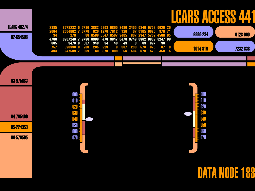
Orange and blue monstrosities
Start with Steve Krug’s Don’t Make Me Think, if you haven’t read it already. It’s the baseline by which we set up the way we think about effective design and usability. From there, Abby Covert’s How to Make Sense of Any Mess will help you think about information architecture and information design. Universal Principles of Design by William Lidwell, Kritina Holden, and Jill Butler is a great resource to have on your bookshelf so you can pull it down, read a principle, think of how you might apply it, and then let that brew in the back of your mind while you work. (Note: you will be changing how you see the world, which means you will spend a lot more of your time cursing bad design you never would’ve noticed before.)
Because you’ll be designing the future, you should listen to 99 Percent Invisible’s Future Screens are Mostly Blue” (then listen to the rest of the podcast. And always read the plaque.)
If you’re more of the blog-reading type, you’ll be interested in A List Apart, Boxes and Arrows, and The Interconnected, for design and development, information architecture, and UX soft skills respectively. (Or maybe I should say read the archives, because most of the authors and editors of those blogs will be dressed in purple uniforms and saving the world more than normal.)
And while we’re still Khan-free, you can find lots of us talking about User Experience on Twitter. Feel free to ask us anything! We only shoot tyrannical genetically augmented humans, generally.
