
It has been almost a year since Umbraco 8 got released. With that release, 3 new features were key the selling points. Language variants, infinite editing and content apps. But another big change has since kept the community discussing.
With Umbraco 8, the notion of separating document properties into tabs were no longer. Instead Umbraco opted for a single view of properties separated into distinct groups. A decision probably made with all the best intentions.
Long before the official release, discussions on this change started. A huge thread on Our was started, in which community members giving their input on pros and cons about the new and the previous document type navigation.
For my own sake, I was unsure about the change, but willing to give it a chance. After all most document types I build are simple in terms of the amount of properties, and I didn't want to let edge cases decide the design.
Tabs might have been flawed in the potential tab overflow, where you have more tabs than your viewport width can contain, or when you have validation errors buried inside of "unused" tabs. But the were equally good when it came to the overview of the structure the document, and easier navigation to the different parts. And of course, the argument to rule them all, tabs was what "we" were used to.
The groups were especially supposed to aid the new split view feature, for editing multiple languages at once, and while it probably does that, you still end up with two editor panes out of sync, as the scrolling isn't synchronized, and the onscreen height of the different properties could still differ between languages.
In addition to that, you were almost certain to get arm injuries resulting from extra vertical scrolling through the properties you need to edit.
The thing I liked the most about the groups, is that you could create more focused groups of properties, without sacrificing horizontal real estate on the screen. Where I previously had a Settings tab for things like URL naming, visibility and other stuff, I could now have a group for each thing.
Another argument for the groups, was that a lot of the properties we were used to create in earlier versions, didn't belong in the document type anyway, but in a Content App. Analytics graphs, static content information, SEO properties and settings were mentioned. The first two is right - they really should just be content apps. Maybe even integrated into the Info app. For SEO and settings I disagree. Usually the content inside those properties are needed when rendering eg. meta tags on your page. And since Content Apps can't edit the content (parts of the community call them Context App for the very same reason), they are really not a good fit for that use case.
Right before the 8.0 release, HQ was kind to put a band-aid on the problem, by adding a dropdown navigation to the Content app. That way the user had a quick way of navigating to specific parts of the document. But the discussions kept on. The community wanted their tabs back.
Community to the rescue
Sebastiaan Janssen came to the rescue with his Cultiv.Tabify package. Originally a content app with the sole purpose of manipulating the HTML in the backoffice to get our beloved tabs back. It has since evolved, to completely substitute the editor view in the backoffice, for a tabbed interface.
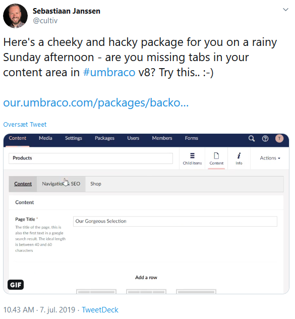
At first I wasn't sold, I still liked the new possibilities groups gave me. And I was reluctant to replace such a crucial part of the CMS with a third party package. I suggested a way to control the tabs in another way, so I could have both. It got turned down, with the suggestion to clone the project and maybe release something brand new.
After the first few builds on Umbraco 8, without using Tabify, the groups started to annoy me. I missed my tabs. And Tabify had gained popularity, and I tried it out again. This time it felt better, but I still missed my super focused groups of properties.
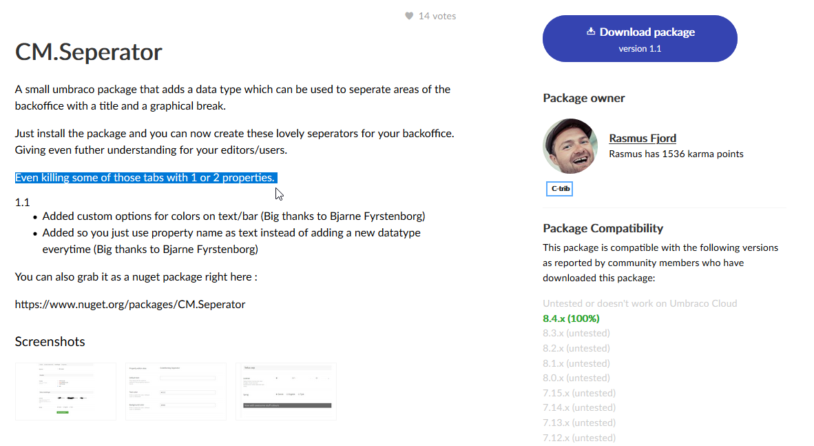
I then remembered how I previously made faux groups of properties in v7 using a package called CM.Seperator by Rasmus Fjord. The description even suggests the ability to kill of tabs with limited number of properties.
Then make it better (at least in my opinion)
So I set out to make the best of both worlds.
Since I wanted groups inside my tabs, I couldn't have the tabs visually sticking to the property panes, so the first part was some CSS changes to Tabify. I tweaked it here and there, to make it look more like the tabs used on dashboards - and made the tab bar disappear if the document type only had one tab.
In the process, I made it into my own thing. To do something like this, the first thing you do, is to inject an interceptor script into Umbraco using a package.manifest. There is an article here, describing how to do that.
The script catches all responses to Umbracos own editor view, and by string manipulation substitutes Umbracos umb-tabbed-content directive with my own directive, called matryoshka-tabbed-content.
angular.module('umbraco.services').config([
    '$httpProvider',
    function ($httpProvider) {

        $httpProvider.interceptors.push(function ($q) {
            return {
                'response': function (response) {

                    if (response.config.url.includes("views/content/apps/content/content.html")) {
                        response.data = response.data.replace("umb-tabbed-content", "matryoshka-tabbed-content");
                    }

                    return response;
                }
            };
        });

    }]);
matryoshka-tabbed-content is the tab implementation, where instead of listing all groups and properties in one view, the groups are visible when they are active. The injected tabslist is made sticky by using the CSS (position:sticky), so it always shows in the top of the editor pane, and the tabs are made to look like the tabs on the built in dashboards. In addition to that, validation errors is shown on the tabs.
<div>
    <ng-form name="matyoshka-tabbed-content-form">
        <ul class="matryoshka-tabs-list" ng-if="content.tabs.length > 1">
            <li class="matryoshka-tab-link" matryoshka-val-tab="" id="tab{{group.label}}" ng-class="{'active' : currentTab === group.label, 'hasError' : tabHasError}" ng-repeat="group in content.tabs track by group.label" ng-click="changeTab(group.label)">
                <p>
                    <i class="icon icon-alert"></i>
                    <span>{{group.label}}</span>
                </p>
            </li>
        </ul>
        <div class="matryoshka-tabbed-content-push" ng-if="content.tabs.length > 1"></div>

        <div class="umb-group-panel" retrive-dom-element="registerPropertyGroup(element[0], attributes.appAnchor)" data-app-anchor="{{group.id}}" data-element="group-{{group.alias}}" ng-repeat="group in content.tabs track by group.label">

            <div class="umb-group-panel__content matryoshka-tabbed-panel matryoshka-tab-content-{{group.alias}}" ng-hide="hide(group.label)" id="{{group.label}}">
                <umb-property data-element="property-{{property.alias}}"
                              ng-repeat="property in group.properties track by property.alias"
                              property="property"
                              show-inherit="content.variants.length > 1 && !property.culture && !activeVariant.language.isDefault"
                              inherits-from="defaultVariant.language.name">

                    <div ng-class="{'o-40 cursor-not-allowed': content.variants.length > 1 && !activeVariant.language.isDefault && !property.culture && !property.unlockInvariantValue}">
                        <umb-property-editor model="property"
                                             preview="content.variants.length > 1 && !activeVariant.language.isDefault && !property.culture && !property.unlockInvariantValue">
                        </umb-property-editor>
                    </div>

                </umb-property>
            </div>

        </div>

        <umb-empty-state ng-if="content.tabs.length === 0"
                         position="center">
            <localize key="content_noProperties"></localize>
        </umb-empty-state>

    </ng-form>
</div>
The stylesheet for this, looks like this.
.matryoshka-tabs-list {
    overflow: hidden;
    margin: -20px 0 0 -20px;
    position: sticky;
    top:0;
    z-index: 1;
    background: #fff;
    width: 100%;
    padding:0 20px;
}

.matryoshka-tabs-list:after {
    content: '';
    position: absolute;
    left: -20px;
    right: -20px;
    bottom: 0px;
    border-bottom: 1px solid #e9e9eb;
}

.matryoshka-tab-link {
    position: relative;
    display: inline-block;
    list-style: none;
    cursor: pointer;
    font-weight: 700;
    font-size: 15px;
    padding: 20px;
    color: #1b264f;
}

.matryoshka-tab-link:before {
    content: "";
    position: absolute;
    bottom: 0;
    left: 0;
    right: 0;
    height: 0;
    background-color: #f6f4f4;
    opacity: 1;
    transition: all 0.3s ease-in-out 0s;
}

.matryoshka-tab-link:not(.active):hover {
    color: #2152a3;
}

.matryoshka-tab-link.active:before {
    opacity: 1;
    left: 12px;
    right: 12px;
    height: 4px;
    border-radius: 3px 3px 0 0;
    background-color: #f5c1bc;
}

.matryoshka-tab-link:not(.active):hover:before {
    opacity: 1;
    left: 12px;
    right: 12px;
    height: 4px;
    border-radius: 3px 3px 0 0;
    background-color: #e9e9eb;
}

/* Validation */

.matryoshka-tab-link .icon {
    display: none;
}

.show-validation .matryoshka-tab-link.hasError .icon {
    display: inline;
    position: absolute;
    color: #d42054;
}

.show-validation .matryoshka-tab-link.hasError span {
    margin-left: 20px;
}

.matryoshka-tab-link p {
    margin: 0;
}
A few css fixes is added to hide the dropdown menu from the Content app, and to reposition the grid re-order bar in order to make things look "not broken".
/* hide the "Content" dropdown (avoid confusion) */
.dropdown-menu.umb-sub-views-nav-item__anchor_dropdown {
    display:none;
}

.umb-editor-container {
    z-index:2;
}

/* push the content, so it doesn't conflict with the tabbar */
.matryoshka-tabbed-content-push {
    height:20px;
}

/* moves the Grid re-order bar down so it doesn't cover the tabs */
#umb-grid > .umb-editor-sub-header[umb-sticky-bar] {
    top: 64px;
}
For the groups, I made a new property editor (yes, it is v7 thinking in v8 - but it works for me). The property editor was not intended to edit any content, it was only for the purpose of making it look like the starting of new group - and possibly, the ending of a previous group.
By hiding the property label (the hideLabel option in package.manifest), and doing some CSS margin hacks, I was able to make it look like the editor pane of properties got split in several panes. Each one starting with a headline.
The property editor view is just a label with some dynamic content from angular, the clever part is in the CSS, where firstly the containing div is positioned relatively in order to create a new positioning context. The container then gets negative margins applied to eliminate the padding from Umbraco. The grey background color from beneath the property panes is then added to make it blend in with the background beneath the property pane.
.our-matryoshka-group-separator {
    position: relative;
    overflow: hidden;
    margin: -20px -21px 0;
    padding: 0 1px 0;
    background: #f6f4f4;
}
The label is then styled like the editor pane with rounded corners, box shadows and Umbracos padding.
.our-matryoshka-group-separator label {
    display: block;
    padding: 20px 20px 0;
    background: #fff;
    font-weight: bold;
    border-radius: 3px;
    box-shadow: 0 1px 1px 0 rgba(0,0,0,.16);
    margin-bottom:-1px;
}

.our-matryoshka-group-separator label small {
    color:inherit;
    font-weight:normal;
}
And for separator properties not being the first in the tab, a pane bottom is added as a pseudo element, aligned to the previous property to make it look like a nice finish to the "previous" property pane. This is were the positioning context is needed. A pseudo element is added with the same looks as the editor pane and positioned so it fits snugly to the "previous" pane.
.umb-property:not(:first-child) .our-matryoshka-group-separator {
    margin-top:0;
    padding-top:40px;
}

.umb-property:not(:first-child) .our-matryoshka-group-separator:before {
    content: '';
    background: #fff;
    height: 10px;
    display: block;
    position: absolute;
    top: 0;
    left: 1px;
    right: 1px;
    border-radius: 3px;
    box-shadow: 0 1px 1px 0 rgba(0,0,0,.16);
}
So now I have a property on my document types for each group I need. The property label is the group name, and I can even use the description field to add more information to the editor.
For the most basic text page document type I have, I now only have 3 tabs. Content, SEO and Settings. And in the Settings tab, I have 3 faux groups; HTML snippets, Visibility settings and URL settings.
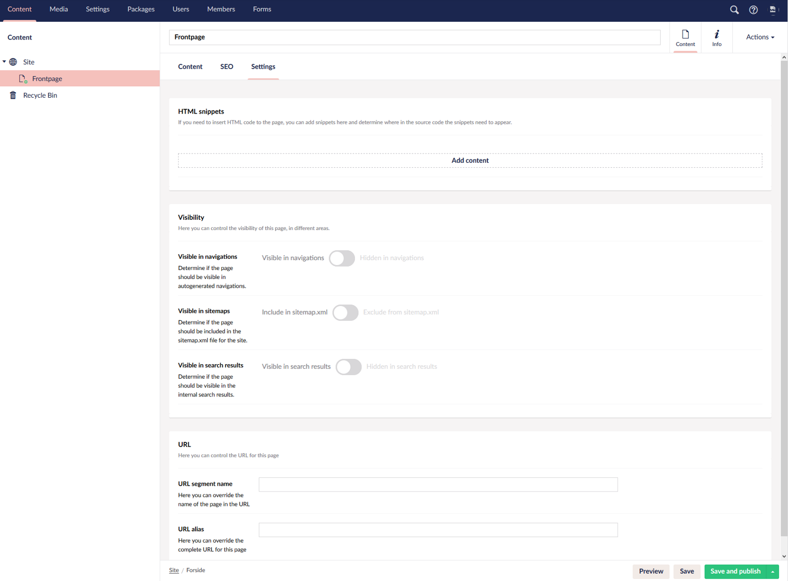
With that I got the best of v7 and v8 combined, with the slight exception that my groups is not real groups. They just appear that way. I think I can live with that, to me, it is a small price to pay for the better overview I get.
Give it back
If you would like the same look for your backoffice, I have released all this as a new package including my version of Tabify, combined with my separator property editor in a package called Matryoshka. You can download it on our.umbraco.com and install right away. It should work for all versions of Umbraco 8.