We need to acknowledge a cold, hard truth: We live in a WordPress world. WordPress has the majority market share for all CMSes, and powers 27% of all web pages. Even for our clients who do not have direct experience with WordPress, the ubiquity of WordPress informs their expectations for what it takes to make a complex, modern site. Clients expect that they can pick a theme from a gallery, and that it will integrate seamlessly with the highly structured data that they want to display on their site. They expect that they can incorporate advanced functionality with minimal or no configuration by installing widgets and plugins.
This expectation, of course, is nonsense - but that doesn’t matter. It doesn’t matter that this isn’t reality, that this approach is ill-suited for anything beyond the simplest personal blog. This is a very real expectation that Umbraco agencies confront on a regular basis, and we, both as web agencies striving to improve client satisfaction, and the Umbraco community as a whole, need to address.
Why do we live in a WordPress world?
Beyond the aforementioned domineering market share, there is one glaring reason for the discrepancy between client expectations and reality: We overestimate technical literacy. A fascinating report by the Organisation for Economic Co-operation and Development details an enormous study on technical literacy, testing 215,942 people, aged 16-65 in the workforce.
The findings are bleak. Study participants’ technical literacy were divided up into levels:
- Level 1 - 29% of the population: Can perform operations involving sorting or searching by a single, easily-inferred metric, e.g. “Find all emails from John Smith”.
- Level 2 - 26% of the population: Can also perform operations that involve sorting or searching by multiple metrics, e.g. “Find all sustainability-related documents sent by John Smith during last October”.
- Level 3 - 5% of the population: Can also perform operations that require sorting by multiple metrics across multiple programs, e.g. “Find what percentage of emails sent by John Smith last month were about sustainability”.
Discouraging as that is, you may notice that those numbers don’t come close to adding up to 100%. Right now you may be thinking that I overestimate my own mathematical literacy.
- Below Level 1 (the report is too polite to call them “Level 0”) - 14% of the population: This group can only perform operations involving a single, well-defined function, requiring no reasoning skill, actions like “Delete an Email”.
We still aren’t to 100%.
- Cannot use computers - 26% of the population
Granted, this last group is not the target audience for your Umbraco website, but these people may work for your clients. Recall that this study surveyed adults, ages 16-65, in the workforce. It excludes both the elderly, and adults who are not working, two groups who are likely to be less technically literate than the population at large. This report may actually overrepresent our collective technical prowess.
I don’t bring this up to be a tech evangelist, or a motivational speaker, to get everyone pumped up about how smart they are; I bring this up to emphasize an important, and very often overlooked fact - we are all technical people. I assert that there is a false dichotomy in web development agencies between technical and non-technical roles. Novice developers can look with envy at people with 5000 reputation points on Stack Overflow and tell themselves they are not technical. Designers who are wizards with CSS, but struggle with certain JavaScript frameworks can convince themselves they are not technical. Project Managers with dubiously utilized computer science degrees (hey, that’s me!) can bandy about terms like “Stack Overflow” and “JavaScript frameworks” but secretly suspect that everyone else in their office literally thinks in binary.
It’s easy to internalize this falsehood, but it’s important to realize that we are all technical people. If you found this blog post, you are all but guaranteed to be near the uppermost echelons of technical prowess. Regardless of job title, you very likely know more about technology than your clients, and you definitely know more than them about Umbraco. We all – project managers, designers, developers – need to be eternally cognizant that what seems intuitive, obvious, maybe even borderline condescending to us, needs to be extremely well explicated to our clients. I have never had a client complain about excess documentation.
This is the situation that we have inherited. Following are some of the common expectations that I have encountered, and the concepts and ideas that have most successfully warmed clients up to the idea that Umbraco, being geared towards custom code, is the best solution to provide a maintainable, predictable, and safe site, that will best meet their needs in the long-term.
Design
The client expectation: Custom design is expensive, Themes get me what I want, more quickly.
The correct response: Custom design is precise, maintainable, and may have lower costs long-term. It enforces compliance with corporate branding requirements.
Really sexy tagline, isn’t it? It practically sells itself.
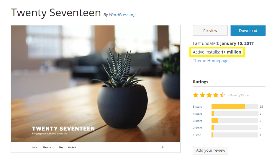
The first line of defense I employ in defending custom styles is straightforward: your company spends a lot of money on corporate branding, it deserves it’s own unique aesthetic for its online presence. You can select a great, slick-looking free WordPress theme, but your site will be literally one of a million to employ that style.

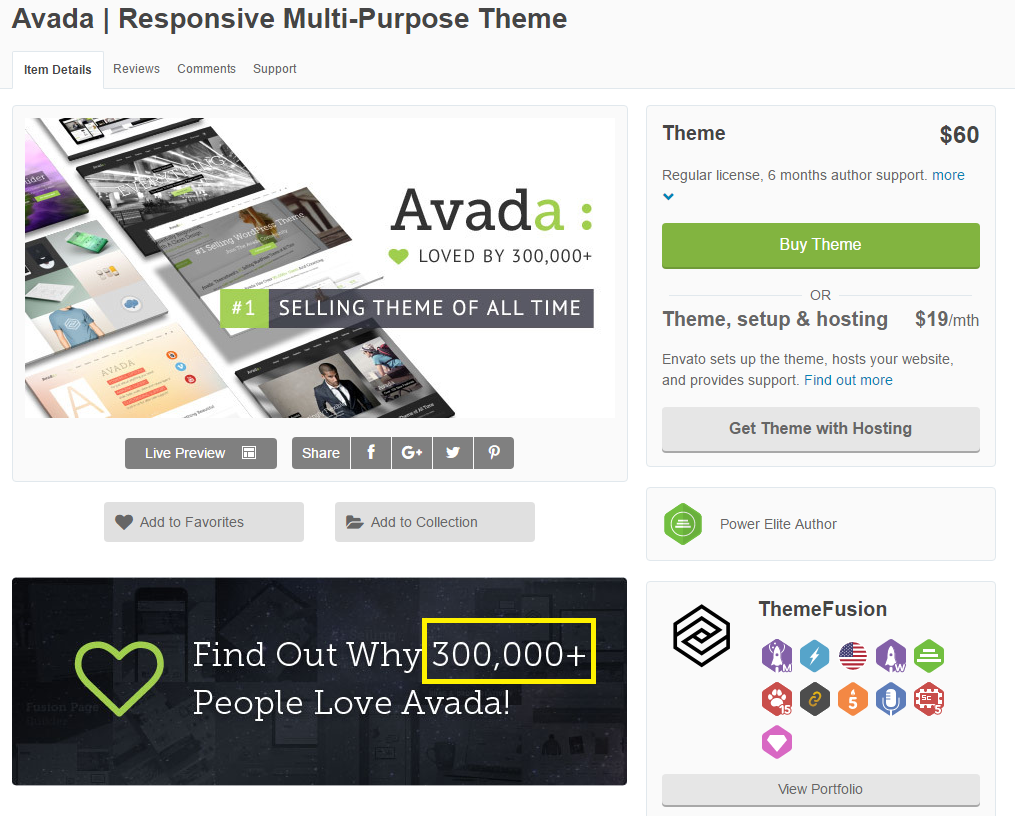
If you choose a paid theme, you may be one of ten thousand.

Publicly available themes aren’t just generic, they are generic by design. And why wouldn’t they be? The people who create these themes are trying to sell them to as many people as possible. If you go custom from the ground up, it’s guaranteed that your theme will be uniquely yours. Your corporate branding is not only best served by custom design, it can only be truly served by custom design. There are many front-end WordPress developers who can tweak a theme until at superficial glance it appears unique, but the user experience will have a very “samey” feel. Arguing otherwise is like taking another company’s logo, tweaking it a little bit, slapping your name on top, and declaring “Good Enough!”.

More importantly, client designs are notorious for best-case scenario content. Once you rip out that Lorem Ipsum and those iStock photos, how will the premade theme fit your site’s real data? Complex corporate sites very often have complex, highly structured data. With the obligate disclaimer that I am not a designer, I find modern web design is very minimalist. I’ve fielded several requests recently to make corporate sites, and especially their navigation, “clean”, “simple”, or “minimal”. These tasks are challenging with custom code. These tasks are nearly impossible with premade themes, and their associated rigid architecture.
Simple ≠ Easy, Complex ≠ Hard

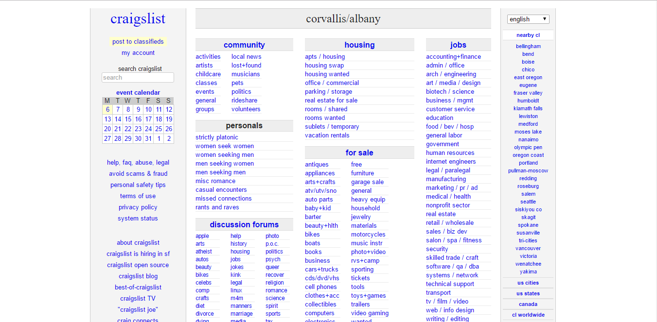
This is (and I am still not a designer, so bear with me) a “simple” design gone wrong. This is a company’s entire homepage. There is no below-the-fold. A site visitor needs to, from this abstract facade, figure out how to get to the content of this page. Remember our report on technical literacy; are people who can barely filter emails by sender going to figure out how to use this site? Simple might be good, but only when it fits the data. Trying to shoehorn multifaceted data into the wrong theme, especially a very minimal theme, is a recipe for a constant content-editing headache. Your clients pay a lot of money to get every single visitor to their site. They may as well throw that away if users get frustrated on the homepage and immediately leave.
Conversely, complex is not always hard.

Hell, sites don’t even have to be pretty to be usable, it’s more important that it be structured around the data it is trying to show. Regardless of how complex the data, it can be shown in a logical, intuitive fashion, given the right framework.
Regarding frameworks, we want these pages to be so well tailored that an intern at your client’s company can waltz in on day 1 and create a page that is consistent with their corporate branding. We enforce corporate branding, so you don’t have to. You will never find that degree of scaffolding in an off-the-shelf theme. Especially if you are like ProWorks, and your point of contact with clients is typically someone at a senior manager or director-level position in marketing, this is an easy, easy sell. We take some of the burden of proofing content off of them.
Intentionally not mentioned in this discussion are any references to browser testing, accessibility, or responsive behaviors. All very important factors to consider, but ones that in my experience are negligibly valuable selling points to clients; the kinds of things they don’t care about until after it is already live and causing problems. I’d love to hear if you have any success pitching these benefits as a reason to use custom styles.
The takeaway message: Custom design + frameworks for enforcing corporate style guidelines = a consistent, easy to navigate site, regardless of data complexity.
Development
The client expectation: Plugins allow me to get new functionality, quickly.
The correct response: If you try out many plugins, you might find one that doesn’t completely break your site and approximates your business need...but it won’t be exact. Custom gets you exactly what you want, and nothing more.
Let’s roleplay for a little bit. I’m a client with a WordPress site, and I want to:
- Add RSS links to blog articles.
- Minify the JavaScript across all pages on my site.
- Add an option to edit canonical URLs from the administrative interface.
These are all real client requests that I have received in the past couple months. Were I to look for plugins, I would search for the first popular, highly rated package that meets each of these needs.
To add RSS links to blog articles, the first package I found is Yoast, a popular (3+ million installs) SEO package. The core package offers 10 categories of features, each of which has a few subfeatures of it’s own. One of those is the option to add RSS links to blog articles.
To minify JavaScript, I opt for W3 Total Cache. It has a 32-item bulleted list of the features it offers, including a baffling promise of 10x improvement in site performance. My mouth is already salivating at the prospect.
Lastly, I show moderate restraint in my last package installation, All In One SEO Pack, which provides a modest 19 separate features in its free version. With that, I’m all ready to go with my new features. Indeed, I was able to get the three features I originally wanted by installing common WordPress packages. Let’s check out what else I got:
- Two separate, auto-generated XML sitemaps
- Two sets of undefined “security enhancements”
- I’m now caching damn near everything on my site
- Three applications that independently promise to increase page speed.
With all three of these massive packages, what is the end result? Does my site run like greased lightning? Is it at the top of every Google query ever? The answer, obviously, is no. Some of the packages may have some features that are useful, but most are probably going to be neutral, and some may be negatives. Turning on default caching of everything, for example, is unlikely to be a boon to user experience. This says nothing about if there are bugs. Because it’s not my own code, how do I debug? General WordPress advice is to update everything, and then hope the issues goes away, and if that fails, to uninstall other packages that you deem may be causing conflicts. Of course, there are always the official support forums.

At best, I now have some features that approximate what I really need, along with a lot of bloat. I get to cross my fingers that every new feature I add doesn’t break something previously, and if it does, I get to guess blindly at what packages are conflicting, and then weigh which packages are most valuable.
Custom functionality gets you exactly what you want, and nothing more. It’s easier to work with your complex data, and in the event it needs to be debugged, modified, or expanded upon in the future, it is much, much easier to do. You don’t want the kitchen sink, you want tailored functionality.

Completely missing from this conversation is any mention of administrative interface usability. I’ve found this selling point elicits, at best, a lukewarm response from clients. They may not know how to fully use the tools on their site, but they don’t know what they don’t know. This borders on pretentiously self-righteous martyrdom, but even if clients never know the effort we put into making their back office usable, we owe it to them. It builds their faith in us as experts, it builds their faith in Umbraco. This is, in my experience, the single best way to encourage clients to continue seeking custom solutions, even if they are never directly aware that we are creating these interfaces for them. Remember - we cannot be too obvious.
One parting thought - tone matters. Umbraco is growing, but still small. Every one of our clients bucked the trend when they opted to go with a fairly obscure Danish CMS for their website. We are already all enthusiasts of Umbraco, warts and all, but we can’t assume the same for our clients. I don’t need to evangelize Umbraco to you, but you may need to evangelize Umbraco to others. I genuinely believe that Umbraco is an excellent choice for a huge breadth of websites. I’m proud of the sites we make; we should be proud. Our sites aren’t made from a dubiously cohesive conglomeration of third-party packages. Our sites are borne of sweat, blood, and maybe a little bit of carpal tunnel, and they’re better for it. Umbraco sites, done correctly, give our clients exactly what they want, and help them best meet their business needs. The best way to get clients excited about their sites is for us to be excited about their sites, to embrace the attitude that we can do so much better than “good enough” - we can be exact.
